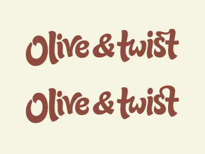
Logo variations
Trying to decide between these 2 logo variations with web designer Rob Turlinckx. The aim is something friendly, clean and modern with some personalised details. The s-t in the first one has a bit of a 'twist' to it, but the second creates a subtle heart shape (passion, care, etc.) Feedback appreciated!
More by Claire Coullon View profile
Like

