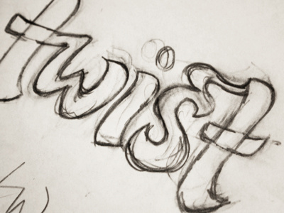
st ligature
Part of some lettering for a logo I'm working on. Started off with a thick Chinese calligraphy brush to get the general shapes and then moved onto pencil for the details. I'm working on the vectoring now, but I'm not sure about the top of the 'st' ligature. The goal is to keep it clean and simple so I don't want it too swirly or decorative, but the junction seems a bit abrupt at the minute.
More by Claire Coullon View profile
Like
