Learn how to build a professional design portfolio by following 5 key principles. Get top tips from digital product designer Alex Muench.

Alex Muench
Written by Alex Muench
Published on
Last updated
As a designer, the centerpiece of your professional presence online is your portfolio website. Most often, a portfolio takes the form of a personal website with a collection of work samples and case studies. It should highlight your skills while also introducing yourself to your audience — potential clients, future employers, or just your followers — both professionally and personally. It’s a space to share what you’ve accomplished, and, if you’re looking for a new role, what you hope to accomplish next. A great portfolio doesn’t only show your work; it tells a story about how you conceptualize and execute solutions to design problems.
While online portfolios can be unique and personal, they should always have a purpose with specific goals. This could include any number of the following:
- You’re a new design graduate searching for your first role
- You’re looking to take on freelance design work and attract your first clients
- You just want to build a space to document your design projects
- You want to grow your professional online presence and build a following of your work
At the beginning of your career, don’t worry about having the perfect design portfolio. Nobody does. It’s far more important to take your first steps rather than stress about having a portfolio that doesn’t look “professional” enough. Most importantly, don’t compare yourself to others. You are on your own path. Others might be in a different stage of their career. Focus on yourself and what you want to achieve.
As a Product Designer at Doist, I’ve had the pleasure of helping to recruit and hire for various design roles. From looking through hundreds of portfolios from designers at all levels, I’ve observed a few common threads amongst the truly effective product design portfolios that showcase a designer’s skills and thought process in a beautiful and compelling way.
It’s important to note that my advice is subjective and comes from my personal experience in this industry as a graphic, communication, and, most recently, a product designer. Take all this with a grain of salt. Don’t apply any advice blindly. Hone in on what you feel is right for you. As you know as a designer: Rules are meant to be broken.

1. Strategize first, write second, design last
As a designer, it’s natural to want to jump into the “designing” part of a project. Excitement builds as you think about cool design ideas and how your site should look. You feel the itch in your fingers to fire up your design program. You may have already jumped into the design phase, polishing small details like changing the color palette or choosing another typeface.
But when you’re first building a design portfolio, these shouldn’t be your first steps. Keep those ideas for later!
Like every problem you try to solve as a designer, write down the core purpose of your portfolio first, what information you need to include to achieve your purpose, and how exactly you want to express your story — visually and in writing. Only then should you start digging into the design details.
“Like every problem you try to solve as a designer, write down the core purpose of your portfolio first.”
Set some time aside “deep work” . Disable notifications, use the app in full screen, put your phone away, and find a calm and distraction-free place where you can think and write. I like to use a minimalistic text editor like the Notes app on my phone — that way, I’m not tempted to start designing too soon. I often tune on some background music that gives me the energy to just write away. Use the predefined text styles of Dropbox Paper or the Apple Notes app to add a little bit of hierarchy for your thoughts. Handwriting and sketching on paper or your iPad works too. I recommend Procreate or Flow by Moleskine.
Quickly brainstorm the message you want to convey with your design portfolio. Then sort those thoughts by priority:
- What’s the goal of your portfolio?
- Who is your audience? Potential clients? Future employers? Yourself? List out the most relevant information these people want to know or read about you. Generally, this includes a combination of things.
- Who are you as a designer? What should people know about me? Describe yourself and the work you do (and want to do in the future)
- First impressions count. Which message do you want to convey with your portfolio? How can you transform this into your design? If someone looks at your website, how can they identify you are a product designer, for example?
- Which projects and work samples do you want to include? Sort them by type of work, time, or just put your most impressive project at the top.
- How should people reach out to me, if at all, and why?
After you have your initial thoughts down, start refining, rearranging, and adding structure to the information you want to convey. For designers, it can be tempting to jump from “executing mode” to “polishing mode” and skip planning mode altogether. It’s like the writing process; write first, edit later.

2. Make your website simple, scannable, & accessible
Once you get to the design phase, keep the viewer’s experience top-of-mind. During your research, you probably saw websites that inspired you and design trends you want to incorporate in your portfolio. Do this in moderation. Good portfolios are firstly well organized and readable, not visually overwhelming. The following are some good rules of thumb to follow:
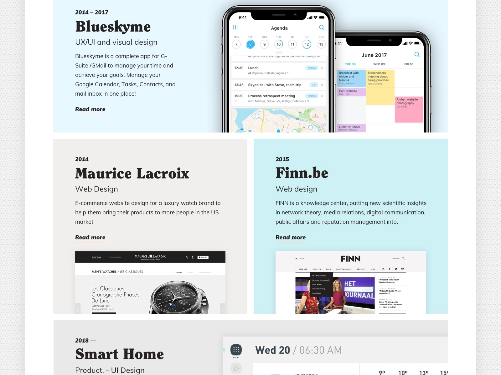
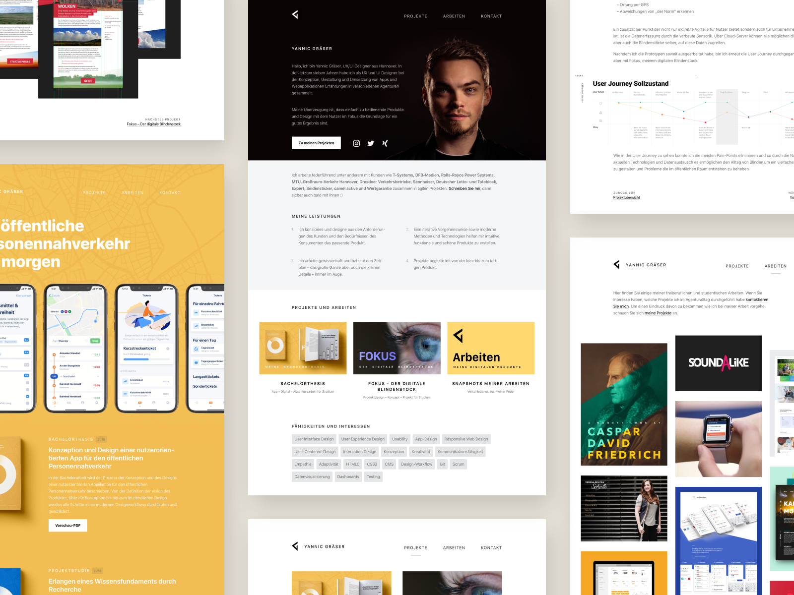
Make it skimmable — Keep in mind some visitors will only skim your site. Make it easy to scan your work and don’t overcomplicate things. Break text in multiple short paragraphs, add headings and explainer images, include rough sketches and other visuals that show your process.
Include a clearly accessible navigation — In most cases, your menu should include:
- Your work: Including samples, your projects, client quotes, case studies
- About me: A place where visitors can read more about you as a person, what you currently do, your future ambitions, your hobbies, anything that’s interesting about you. Feel free to add a photo to make things more personal.
- Contact: A way to reach out to you. Here make it clear what you offer or why people should contact you. This highly depends on the goal of your portfolio.
- Start page: A link to the start page, could be called “Home” or just your name in the top left. An easy way for viewers to get back to the beginning.
It’s tempting to get clever with your navigation options, but the people looking at your portfolio will expect certain navigation patterns. “Getting creative” with how you organize information and name options will likely just make it harder for them to find what they’re looking for.
Keep animations, fonts, and colors simple — If you want to be on the safe side, use a basic typography setting with fonts that render well on any browser and colors that meet the minimum contrast ratio defined by W3C , the World Wide Web Consortium.
You may also want to spice up your site with fading animations. While they might be visually interesting, they are inaccessible for people struggling with vestibular disorders of the inner ear that affect “as many as 35% of adults aged forty years or older in the US”:
“[Vestibular disorders] often manifest as motion sensitivity on the web. Animations, unconventional scrolling, and parallax backgrounds can cause headaches, dizziness, and nausea, sometimes lasting long after the animation is over.” — Excerpt from Laura Kalbag’s Accessibility for Everyone book.
Design (and test) with mobile in mind: Think about how people access your site nowadays. For example on mobile where scrolling is different than on the web. Here, custom scrolling animations are often just distracting and a pain to use. Similarly, a paragraph that looks reasonable on desktop can be overwhelmingly long and hard to read on mobile. Make sure you’re testing your web designs for smaller screens, or even design for mobile-first.
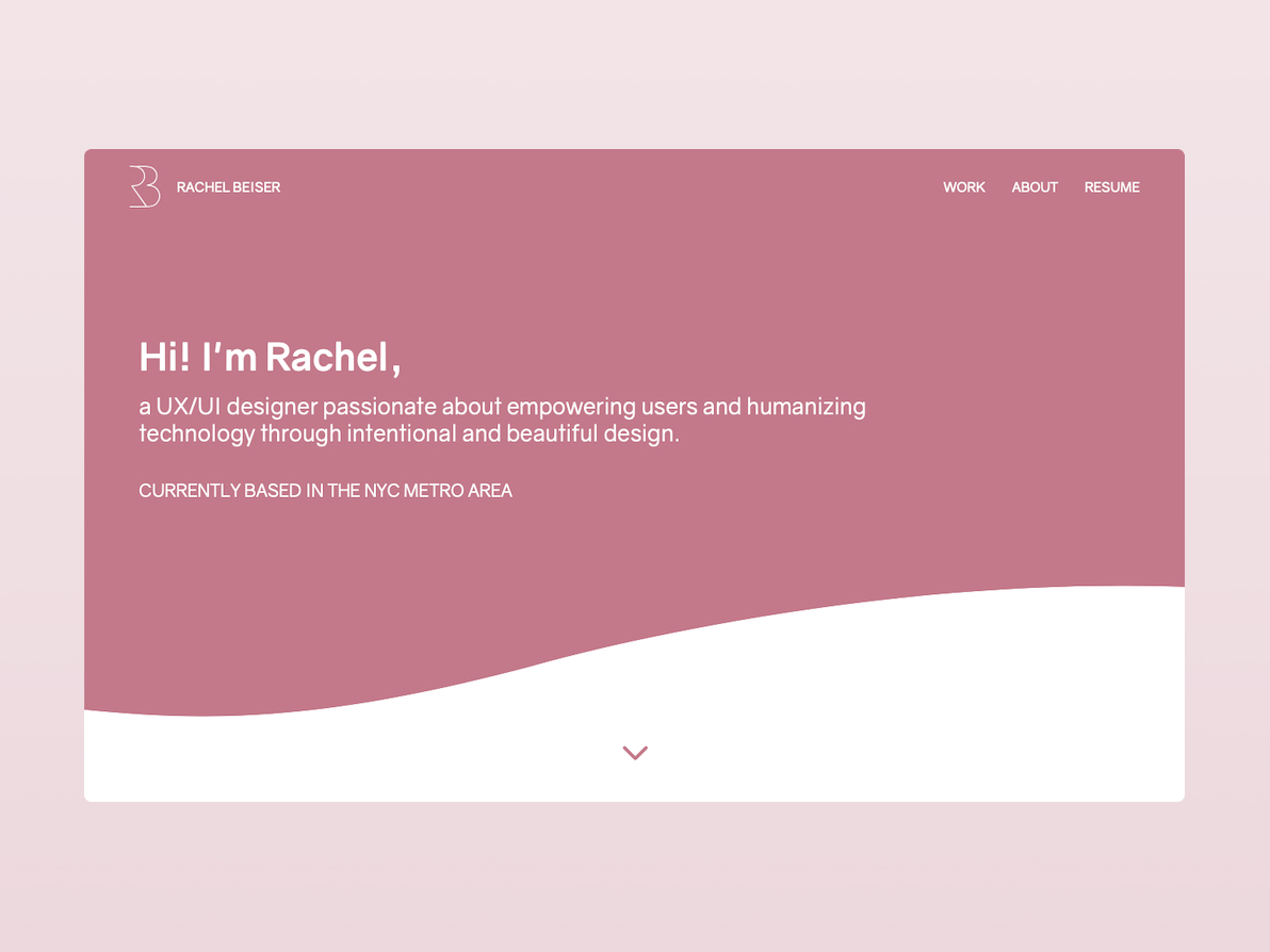
You don’t need a personal logo: Of course, if you’re a graphic designer who focuses on branding, a logo is a great opportunity for you to show your skills right off the bat. If you are a product, UX, or web designer, it’s better to focus on presenting your skillset in the content of your portfolio. In most cases, it’s enough to write your name in your header or introduction text in a font of your choosing. Ideally, in a weight of the same typography family that you use for any other text on your site.
Use a no-code portfolio builder: Once you have your content planned and written, there are lots of portfolio website creator options to choose from. Check out WordPress, Webflow, Squarespace, Cargo, Tumblr, or Dribbble Pro. They let you browse templates to start, drag and drop images, bring your design to life quite quickly, and don’t require much coding knowledge. Focus on what you do best, the design. If you want to present product design prototypes, for example, you can embed Marvel or Invision prototypes.
Overall, apply design elements thoughtfully and respect everyone who might be clicking the link to your portfolio. Make it work, make it readable, then make it pretty. Keep the focus on your work and the story you want to convey to the viewer.

3. Focus on the projects you loved working on most, even if it’s just two
If you are a new designer, you most likely don’t have much work in your repertoire (yet!). Don’t worry. Everybody starts out like this. It’s more important to show your approach and how you think than to have pages and pages of work examples.
University projects are as valuable as client work or side projects. If you are proud of it, use it. Was it a small client but you enjoyed solving this particular problem for them and the results? Perfect. Put it in your portfolio. Have volunteer work or even a real-world problem you mocked up solutions for on your own? Both are equally valid when you’re starting out.
“Just because you are starting out, doesn’t mean the content you showcase is not valuable. Be confident in your work so far.”
Even for folks with lots of design samples to choose from, I recommend only including the design projects in your portfolio that show exactly the type of work that you would like to continue doing. Exclude any previous projects that you didn’t enjoy or any disciplines that you don’t want to continue doing.
And if you are still figuring out your desired design discipline and are exploring different fields, documenting that UX exercise or illustration project you did for a class is an amazing exercise in self-reflection and discovery.
Just because you are starting out, doesn’t mean the content you showcase is not valuable. Be confident in your work so far.
4. Write about your work process in detail
Make sure you’re getting the most out of each portfolio piece, especially if you’re short on pieces. People who want to work with you want to know how you approached the problem. It shows extra care if you add what you loved and learned about this project and what you would do differently now. We all know we have to make tradeoffs due to deadlines — talk about any constraints or problems you had to navigate.
A good structure to follow when writing a case study is:
- Problem
- Goal
- Hypothesis
- Your process
- The solution
- Your conclusion
- Your learnings
Most importantly, write about your role in the project. Too often designers just objectively present the design work. You might know which pixel and icon you designed, but how are others able to judge which piece of work or design decision has been created or influenced by you? Be precise and ideally make this point clear right at the beginning of the case study.
Unsure whether you should include work that you influenced but didn’t directly design? Simply own your part of the project and describe it from your perspective. Were you solely responsible for the research, UX wireframing, interface design, or leading and organizing the team?
If you are unsure about showing work that you influenced in one way or another but didn’t directly design, emphasize your role and show your process from your perspective. Make it clear from the start that you are a problem solver, leader, researcher, etc or all of the previously mentioned. For example: Add wireframe sketches, photos of your team discussions on whiteboards, a project plan you put together, customer surveys you designed and ran — anything that showcases how you think, collaborate, or problem-solve.
5. Collect and document your work while it’s fresh
Out of sight out of mind: We are all familiar with this phenomenon. There’s always a next project that needs our attention, and you may not even be thinking about applying for a new job or attracting new clients. But the best time to organize and write about your work is when it’s still fresh in your mind.
Write case studies directly after you finished a project or shipped a feature. It helps you recap what you accomplished, document your process, and reflect on what you’ve learned.
- Always start with writing: Goal, problem, hypothesis, your process, the solution, your conclusion, your learnings.
- Visualize design details with videos/demos/short animations (keep the original design files at hand). Take screenshots of the finished work on various devices. You never know when you need it to present in mockups or future presentations.
- Use a cloud folder to store your written and visual documentation (a text doc and design files/exported images).
- Commit to posting on Dribbble regularly.
Bottom line: Treat your portfolio like the living document it is and invest the time right after you’ve completed a project you’re proud of. Your future self will thank you because forgetting details is easy when you wait for too long.

Keep building on your design portfolio
Remember that we all start small. We learn and evolve as we go. The more work you put out into the world, the more you’ll know what you want to put into your portfolio. Starting simple is just fine.
Written by Alex Muench
Published on
Last updated


