Learn 5 big portfolio red flags that will send potential clients running. Avoid these portfolio mistakes to attract, build trust, and land more new clients with ease.
Renee Fleck
Written by Renee Fleck
Published on
Last updated
To help you build a stand-out design portfolio that gets you hired, we chatted with co-founder and CEO of Playbook.com Jessica Ko who shared insights into the most common mistakes designers make when it comes to their portfolios.
Jessica has designed products and recruited designers at Google for seven years, built design teams at startups for six years, and even founded a design fellowship program, Design Collective. Needless to say, she’s reviewed tons of design portfolios, from abysmal to freaking awesome. Below are the 5 most common mistakes she recommends you avoid and why.
This post was written and sponsored by Playbook.com — a visual cloud storage platform for designers.
Mistake #1 — Personal branding that’s unpolished or distracting
Imagine you’re on a date and the other person shows up with their clothes unwashed, hair disheveled, and sneakers covered in dust. Now imagine a portfolio website cluttered with bad grammar, inconsistent visuals, and low-resolution images.
When clients and hiring managers look at these portfolio websites, it takes them less than a second to decide you’re not a serious contender… and assume you just aren’t that into them.
Mistake #2 — Using low-fidelity images
“Sadly, they’re everywhere,” says Jessica. “They’re in at least 70% of portfolios I’ve seen.” Showing your work in low-resolution images is like an artist selling her masterpiece for 20 bucks at a thrift shop.
Senior designers know this very well, and will typically spend at least 50% of their time on the presentation of their work. “This is the easiest thing you could possibly fix.”, says Jessica.
Mistake #3 — Showcasing styles that died eight years ago
Clients and hiring managers are more likely to bet on new designers than those who bring in outdated styles. Designs are changing every year, and it’s not always easy to keep up.
Are you the kind of person who puts in effort to keep up with the latest design trends? Are you constantly learning and improving your skills? This will greatly improve your chances of getting clients or the jobs you want.
Mistake #4 — Not targeting your desired role or company
A portfolio with little or no relevance to the role or the company you’re applying to isn’t going to land you the job. Clients and hiring managers are naturally attracted to those who can help solve problems they’re already facing.
Don’t have enough work experience? Pick a problem in their product flow and redesign it on your own time. You’d be surprised how much employers like seeing self-initiated projects.
Mistake #5 — A lack of personality
Your profile photos or social media comments should always paint you in the best possible light. Clients and hiring managers look for reasons to like you. “One third of our lives is spent at work, and we want to spend all that time with people we like. And portfolios are a great way to get to know the candidate’s personality,” says Jessica.
A couple of tips: A smile goes a long way in your photos. And try to be nice when it comes to comments (rather than sounding très cool). If your work is good, the next thing clients will want to know is whether you’re the kind of person they’d enjoy spending five days alongside.
A simple 3-step approach to make your design portfolio shine!
- Keep your website simple and timeless. When in doubt, use black and white. The loudest voice on your website should be your work, not your personal branding.
- Try to sound friendly, positive, and humble.
- Make your portfolio relevant to your desired client’s needs. They’ll love it.
Bonus: Don’t be afraid to send a short, personalized note expressing your passion for the project or company.
Get inspired by 🔥 designers from the Playbook.com community
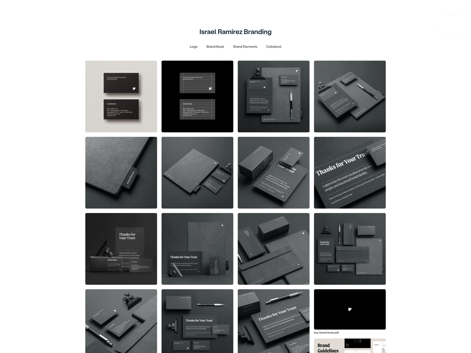
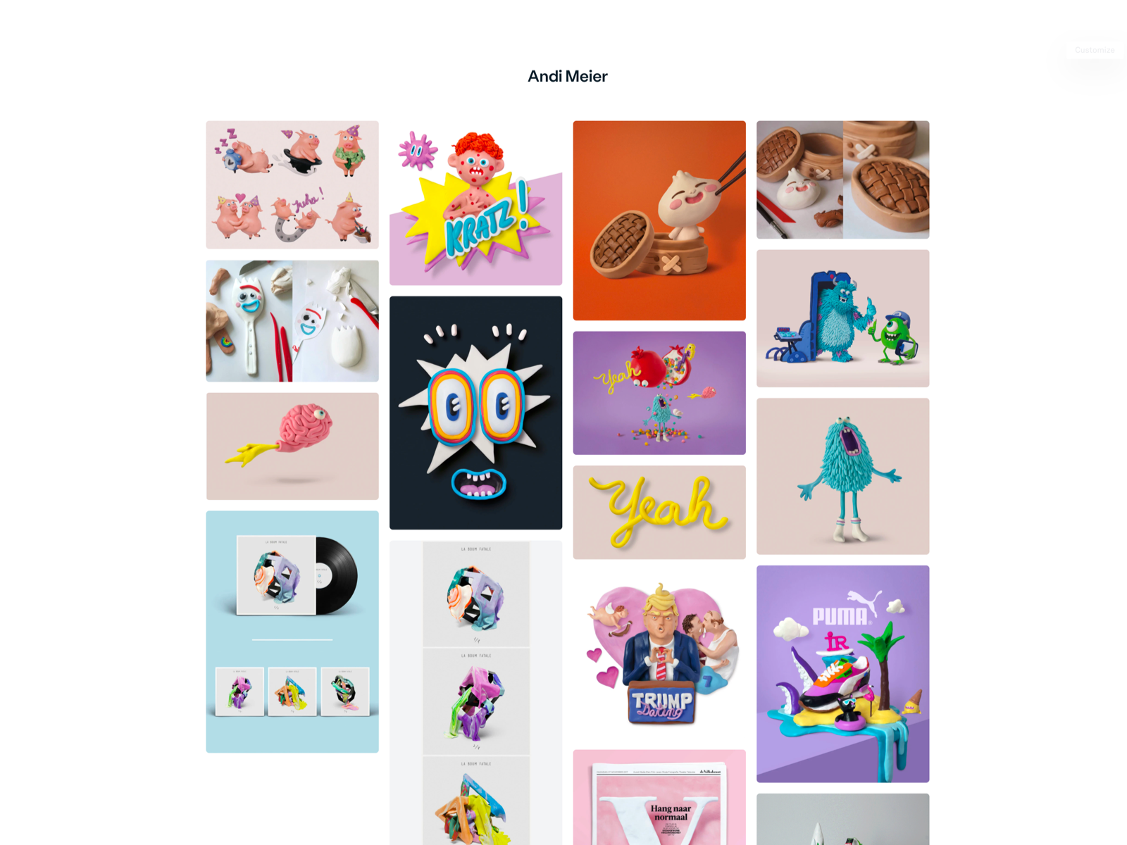
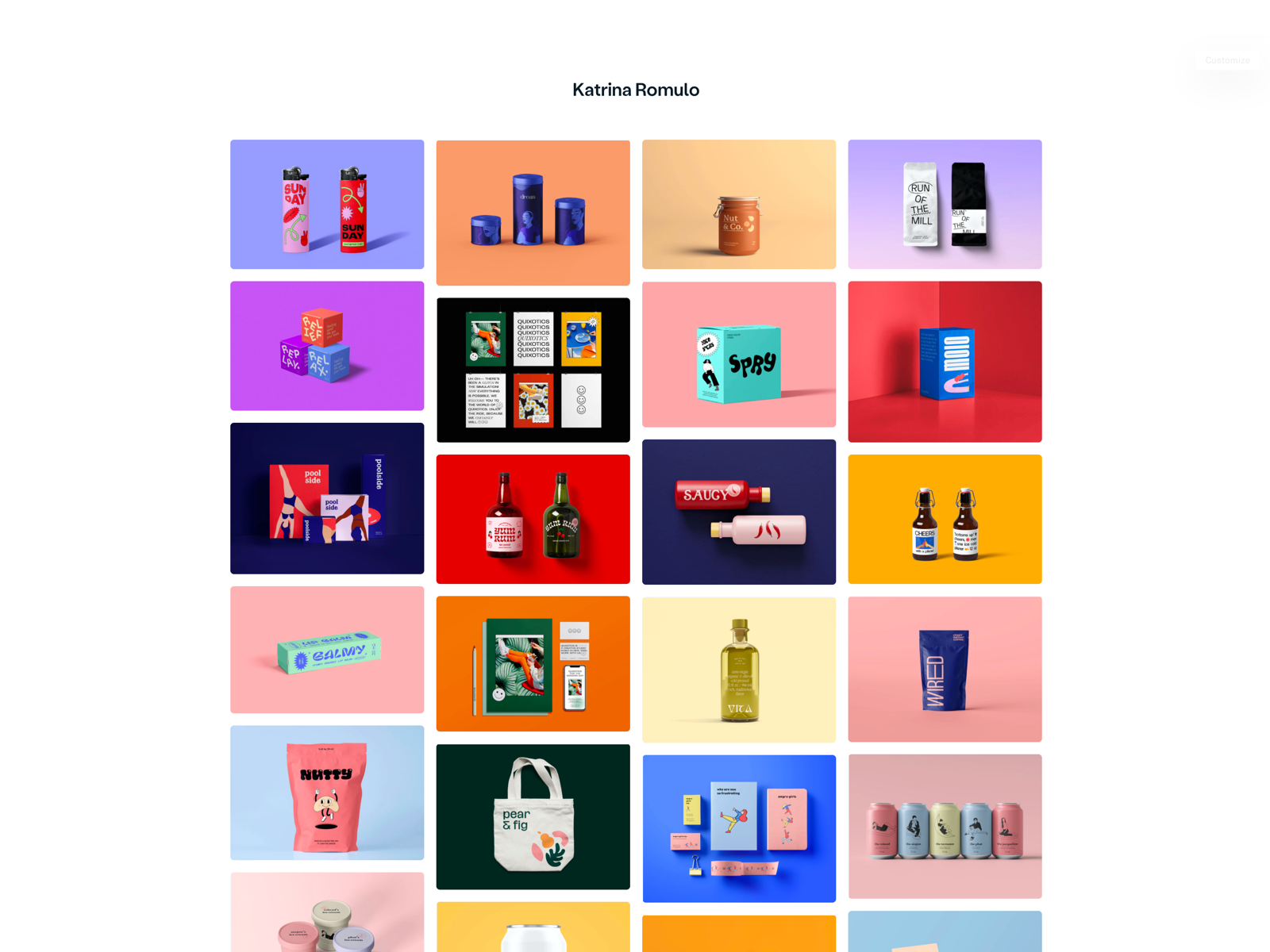
With Playbook.com, you can instantly turn your work into a quick and squeaky-clean board to share with your clients, straight out of your cloud storage. Dribbblers, you’ll get a free Pro account (4TB) if you sign up this month. Why wouldn’t you want 4TB storage?! Check out more fun shared boards on Playbook.com.
Written by Renee Fleck
Published on
Last updated


