Get inspired by unique graphic designer portfolios and learn what makes them memorable.

Renee Fleck
Written by Renee Fleck
Published on
Last updated
Looking for some creative ideas for your personal website? In this sponsored post by our friends at Domain.ME, get inspired by some outstanding graphic design portfolio websites and learn why they stand out from the crowd.
Personal websites are no longer a luxury but a necessity. They serve as a reflection of your personal brand and give potential clients and employers a sense of who you are. Nowadays, with so many website building platforms on the market, there’s no excuse for not having one of your own!
So, if you’ve been putting off creating your personal website, now’s the time to buckle down and focus your attention on cleaning up your online presence.
Today we’re highlighting four graphic designers who have designed outstanding portfolios, featured both on their personal website and Dribbble profiles. So without further ado, here are a few Dribbblers to gain a little inspiration from:
1. Let your personality shine like Lauren Herda
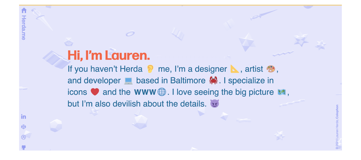
The well-known stigma of creating a website goes like this: It’s a tedious task that takes a lot of work. While, yes, some websites do require a lot of effort, others do not. Lauren Herda is here to prove our point—her whole website is built on just one landing page, and she’s managed to make it a fun, engaging experience.
If you head over to Lauren’s website, you’ll immediately be greeted with a funny, welcoming message telling you a little bit about her, followed by a select few projects she has worked on over the years. Last but not least, a parting message at the bottom of the landing page.
Lauren doesn’t shy away from letting her personality shine through her website through a heavy dose of emojis, a colorful palette, and a playful patterned background. Her website design choices reflect her own style through fun shapes, bright colors, and cartoon-like ideas.
Remember, your personal website doesn’t have to be cookie-cutter. Take this opportunity to show prospective clients your unique and awesome personality through the design decisions you make. And don’t forget to enjoy the process while you’re at it!
Lauren Herda, Interactive Art Director at Mindgrub. I make these things look good.

2. Use an alias to reflect your brand like Luka Zaric
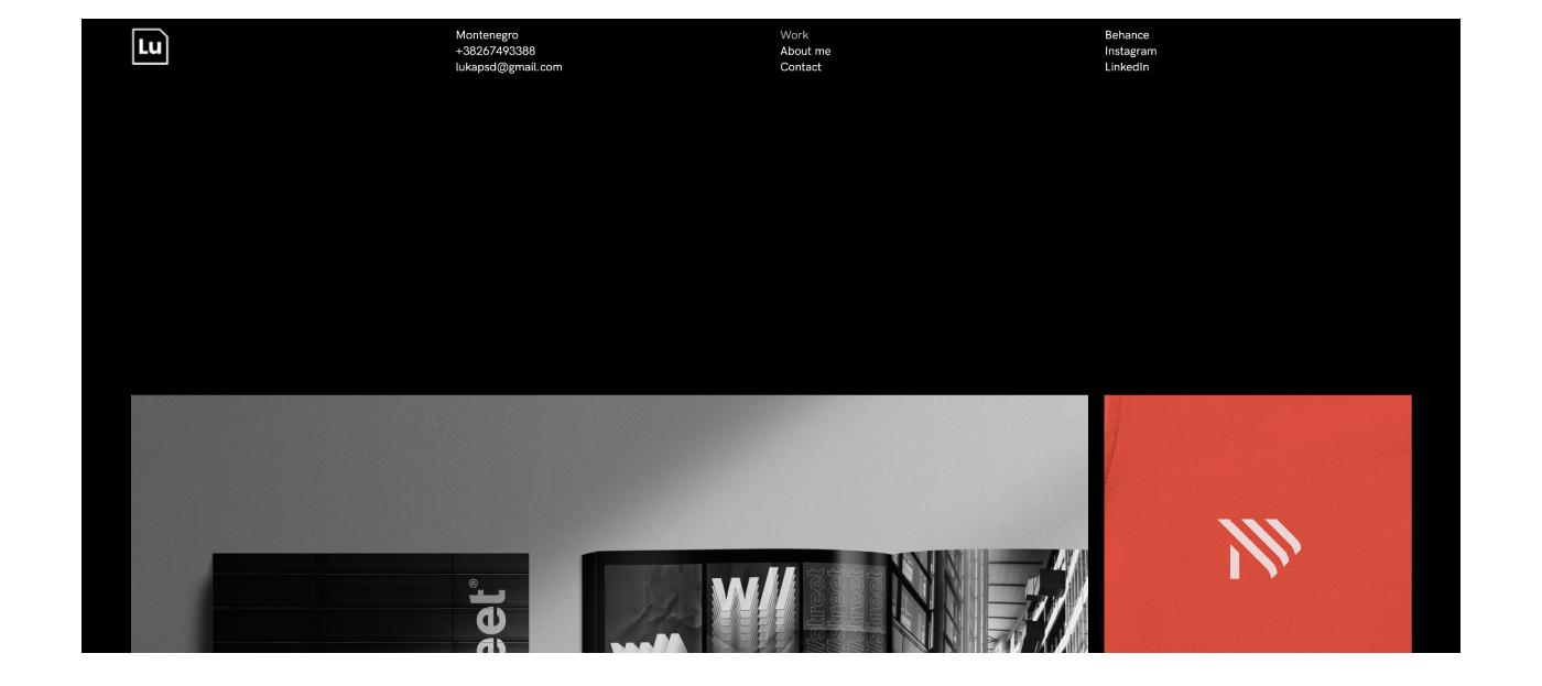
Here’s a little something different. Unlike most domain names for personal websites, graphic designer Luka Zaric has neglected the unwritten rule—using a combo of Your Name and Surname.
Instead, Luka chose to feature his first name along with something known to every designer—’PSD’. The idea for his domain name (LukaPSD.Me) originated from his nickname in high school when he first started dabbling with Adobe Photoshop.
If you have an alias you’ve been using for a while now, connect it to your domain name. This will not only help you own the search results for this name, but you’ll also tie in your personal brand. Take it a step further and design a personal logo that reflects both your alias and domain name like Lukas has cleverly done!
Luka’s personal brand also reflects the minimalist layout on his website. A short, but descriptive bio, when paired with his design, gives you just enough information to piece together a story and have a better understanding of his work.

3. Make a bold statement like Theresa Baxter
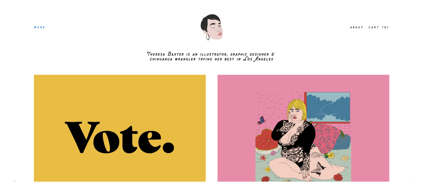
Now here’s someone you should keep an eye on. As she describes herself on her personal website, Theresa Baxter is an illustrator, graphic designer & chihuahua wrangler trying her best in Los Angeles.
For Theresa, art is the source of her inner strength and emotional superpower. Devoting her time to art has helped her cope with different situations and taught her an important lesson along the way—from nurturing the relationship with your body to embracing what makes you who you are. Her work portrays her true colors without any pretenses.
Theresa makes her personal statement clear in her ‘About’ section which reads:
“I am passionate about creative entrepreneurship and art and design as tools for radical paradigm shift. I believe that we can change ourselves and our world through representation.”
Just like Theresa’s website, your personal site can be a place where you make a statement or challenge the “status quo”. It can be a place where you help people feel seen, heard, understood and validated. Use your About section to vocalize your message and help people better understand the point of view in your work.
Theresa Baxter, illustrator, graphic designer & chihuahua wrangler trying her best in Los Angeles

4. Emphasize your passions like Nathan Sanders
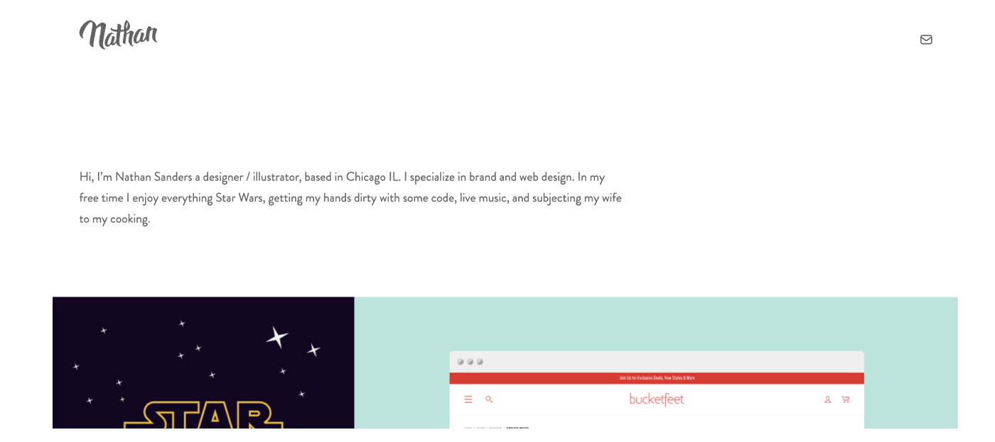
Your website doesn’t strictly need to be a professional platform. As Nathan Sanders has shown—a designer by day and die-hard fan of Star Wars and live music—your personal website can also be your playground. Fill it with your favorite pieces of work that you’re most proud to showcase and that you genuinely enjoyed working on.
This talented designer and illustrator from Chicago shows the full extent of his personality by displaying both personal and professional projects. When you go through Nathan’s website, it’s easy to recognize the passion behind his work. Graphic design is more than just a service he offers—it’s also a passion that he’s clearly enthusiastic about.
When building your own personal website, think about showcasing your best professional side but also the projects that you absolutely loved working on. Not only will this let your passion shine through to clients, but also help you attract the kind of projects you love working on.
Nathan Sanders, Web and graphic designer working in Chicago.

Takeaways
The truth is, no matter how talented you are, if you don’t show the world your amazing work, you’ll inevitably miss out on many opportunities. A personal website allows you to feature your brand identity and appear well-polished to your prospective clients.
And the power of .ME domain? It’s personal, playful, and allows you to express yourself fully. Just take the example of Lauren who took her last name Herda and paired it with .ME — Herda.me, get it? Or how Luka took something that is personal to him and well known in the world of design and made his domain name to be lukapsd.me. Or you can always go with YourNameAndSurname.ME like Theresa and Nathan did! Whatever you choose, we can’t wait to share your accomplishments on our weekly Success Stories!
About the author: Natasa Djukanovic is the CMO of Domain.ME, the international tech company that operates the internet domain “.ME.” She has spent her entire career at the intersection of social media, leadership, and technology, and is constantly trying to figure out the secret to being in three different places at the same time.
Written by Renee Fleck
Published on
Last updated


