Figma’s design recruiter Korin Harris shares product design portfolio tips to get you hired. Learn how to make your portfolio stand out to recruiters and hiring managers.

Korin Harris
Written by Korin Harris
Published on
Last updated
As someone that reviews portfolios constantly, I have respect for the art form. It’s challenging to step outside your own perspective and craft your story in a way that’s compelling to others.
You have to return to old projects and describe their narrative and meaning in fresh, captivating ways. You must also put a lot of blood, sweat, and tears into the arrangement of your work so it’s presented clearly. Crafting a portfolio is no small feat, but if you do it right, you’ll reap major dividends in the job search process.
“Start by putting yourself in the shoes of your target audience.”
I see a lot of portfolios as a design recruiter at the web-based design tool Figma . Applicants often make the same mistakes again and again—from including far too much text in project highlights, to overcomplicating animations on their landing page.
I recommend you build your product design portfolio the same way you would tackle any design challenge: Start by putting yourself in the shoes of your target audience.

Know your audience (and your goal)
Typically in this industry, the person who reviews your online portfolio and decides whether to interview you will be:
- A Design Manager
- A Creative Director
- A Head of Design
- A VP of Design
Leaders like this are very busy. They’re always running to their next meeting, phone call, or candidate interview, so they have limited time to review a portfolio (we’re talking minutes or even seconds). They’re trying to quickly parse a lot of information in that short period of time:
- What type of design you do
- Where your talents and passions lie
- Whether you have the right experience for this particular role
- How you tackle design challenges
- Your overall design abilities
You can’t expect them to dig through pages of content to figure this stuff out. Instead, you need to spoon-feed the most pertinent information for the particular role you’re applying for.
In this post, I’ll teach you how to do that as effectively as possible, both with your portfolio’s landing page and with your individual projects.
Landing page tips:
First things first, let’s talk about some important tips for crafting your portfolio’s landing page.
Make previews of design projects easy to parse
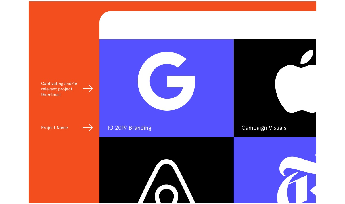
The key to the perfect landing page is to structure each project thumbnail in a cohesive way.
For example, if you’ve done recent projects for a range of top-tier companies and want to show off their logos, make sure each logo thumbnail is the same size. If instead, you want your landing page to represent the actual work you did for different projects, then make sure the screenshots are styled similarly (i.e. the same color background and drop shadow).
Whatever your approach, I recommend labeling each project with key details (like the company name, your role in the project, and the medium you worked in) in a consistent, parsable format.
“There’s nothing that makes me happier than opening a portfolio and seeing eight equally sized, thoughtfully crafted rectangles.”
There’s nothing that makes me happier than opening a portfolio and seeing eight equally sized, thoughtfully crafted rectangles. After all, recruiters have to skim hundreds of portfolios for hours at a time. We’re a lot more likely to go through every project in a portfolio if the landing page has an aesthetically pleasing system to it. It takes less mental energy to comprehend it!
Of course, all good rules are meant to be broken. If you have a really creative way of laying out projects that indicates which one matters most, go for it! Just make sure the thumbnail differences are the result of thoughtful layout decisions, not haphazard design.
Get to the good stuff
How many clicks does it take to get to your work? Does your landing page only consist of “about you” content? Click. Is your “work” icon in the upper right-hand corner? Click. Are your projects laid out so you have to pick one? Click.
Your target audience can’t go hunting for information. Your homepage should give them an overview of your design projects, so they’re only one click away from your work.

Design projects to display
When it comes to choosing which design projects to display in your product design portfolio, you’ll want to tailor your project choices based on your career goals.
Are you interested in mobile, web, or virtual reality design jobs? Make that clear by highlighting your experience in that area. Are you dying to quit the e-commerce industry and want to move into fintech, healthcare, or something else? Choose previous work accordingly.
“Tailor your projects” may seem like obvious advice, but applicants often struggle with this. They try to capture the entire breadth of their design career in one portfolio. They assume people will take the time to go through everything—but hiring managers often can’t.
Here are a few other challenges you may face in picking projects, with a few tips for overcoming them:
1. You worked for top-tier brands… a long time ago
Don’t stock your portfolio with projects from the mid-nineties—even if thatisthe time in your career you worked at Apple. Instead, rely on your resume to show the breadth of brands you worked at, and let your portfolio shine a light on your contemporary work. Of course, if you designed the famous iPod silhouette campaign in the early 2000s, please do highlight that. But don’t feel the need to showcase work that doesn’t represent you as a designer anymore just to show off the brand names.
2. You don’t have experience for the sector you want to focus on
If all of your work is in mobile but you dream of designing for the web, you may struggle with tailoring your portfolio. In this case, I recommend doing a few side projects to develop web-first content, instead of submitting your mobile-only portfolio and hoping for the best. This applies to any and all design roles.
3. Your best work is not in the right medium or industry
Let’s say you have design projects in a range of fields, but your best work isn’t in the right medium for the job you’re applying for. You kicked some serious ass on a recent mobile project, but you want a web-based design job.
Simple: Create a mockup of how that same design would’ve looked and functioned in a different medium (like web), then include both the original and the mockup in your portfolio. As long as you have enough other web-based projects to indicate your experience, we’ll consider you as a candidate.
4. You actually want a generalist role
If you’re interested in becoming the first designer at an early stage startup or joining a smaller company where you have to wear a lot of hats, ignore my previous advice! In the case of generalist roles, you should demonstrate the breadth of experience you have with clearly labeled projects. Make it obvious what medium you did the work in, what your personal role in the project was, etc.

What to highlight in each design project
Much like with your landing page, you should be judicious and thoughtful in selecting what aspects of your design projects to highlight. If you write up nitty-gritty details on every stage of the design process—ideation, whiteboarding, paper prototyping, wireframes, information architecture, UI design, visual design—you’ll make reviewers’ eyes glaze over. They don’t want a blow-by-blow of what you ate for breakfast the second day of user testing.
Instead, think about what kind of role you want as a designer and focus on that. Visual design isn’t your cup of tea? Don’t include it in your portfolio. It’s as simple as that.
That’s not to say you shouldn’t tell a complete narrative about the project. I want to know:
- What problem you were trying to solve
- How you came up with the solution
- What design iterations you went through on the way
- Which role you played in the project
- BONUS CREDIT: What you learned and would do differently next time.
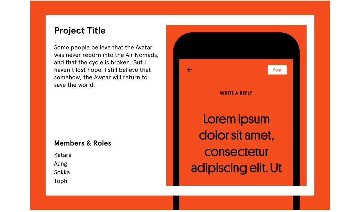
- If you can work it in, it doesn’t hurt to give your team a little shoutout! Here’s an example.
In crafting your story, remember you won’t be sitting next to reviewers, whispering in their ear. Your profile needs to be able to live and breathe without you. Sort through the chaos, share only the most important milestones, and tell a simple, compelling story.
If there are blocks of text with each project, you overshared. You’re applying for a designer role, not a content writing job, so you should create imagery that conveys the information for you. If you’re dying to provide a more detailed case study, then link from your portfolio to a PDF with extensive project information. That way the reviewer can choose whether they want to dive deeper.

Final UI/UX portfolio tips and tricks
Some final tips and takeaways when crafting your product design portfolio:
Spelling counts
Speaking of content, let me just scream from the rooftops: PROOFREADING MATTERS! If there are spelling errors in your portfolio, hiring managers notice. Design VPs often got to where they are because they have an eye for tiny incongruencies.
I’ll never forget showing a strong portfolio to a hiring manager—of a candidate I was really excited about—and the very first thing this manager spotted was a spelling error. It’s hard to come back from that. It may seem unfair that you’re being evaluated on both your visual communication and your spelling skills, but there’s a reason. They both fit into the category of being detail-oriented.
Focus on usability over bells & whistles
Pay attention to the interactions you implement, and resist the urge to include bells and whistles at the expense of basic usability. Some people like to get fancy with things that scroll horizontally/automatically (or via carousels). That’s not always the best for user experience, so you should ask a few people to test what you’ve built. Is it easy for them to navigate your portfolio quickly, or do they have to take some time figuring out how it works?

How to create a UI/UX design portfolio that gets you hired
Phew! You still with me? We covered a lot here. I’ve shared everything I know about UI/UX portfolios after my seven years working as a design recruiter but the most important thing for you to remember:
Always keep your target audience in mind. They’re busy and don’t have the time to spend digging for important information. Use your design skills to tell a strong story about where you’ve been and where you want to go! Keep written text simple, concise, and to the point… and spell check the shit out of it ;).
Written by Korin Harris
Published on
Last updated


