Learn how to make your design portfolio stand out with a strong ‘About Me’ page. Get inspired by these unique portfolio About Me pages from designers.

Renee Fleck
Written by Renee Fleck
Published on
Last updated
This article was sponsored by Squarespace—the all-in-one solution for anyone looking to create a beautiful website.
When it comes to your design portfolio, there’s no one right way to craft your About Me page. As long as it serves a purpose and communicates your intended message, the creative possibilities for how you present this information are endless.
Below, we’re showcasing a handful of unique About Me pages all created on Squarespace using their highly customizable templates. These pages do a great job of highlighting each designer’s creative strengths while speaking directly to their intended audience. Gather a little inspiration as you read along, and start your free Squarespace trial today. When you’re ready to launch your own website, use our dedicated code “DRIBBBLE” for 10% off.
1. Make it interactive
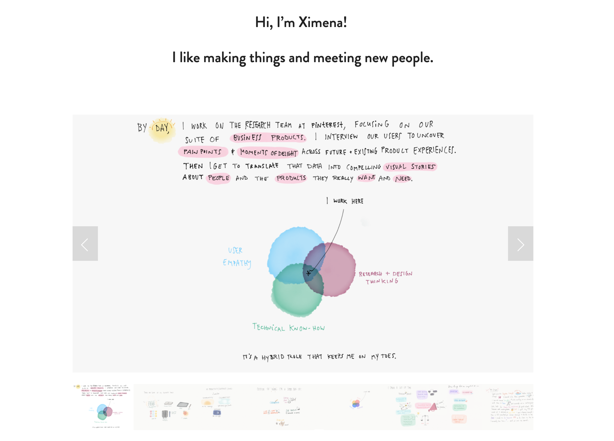
Who says yourAbout page has to be static? A great technique for engaging your website’s visitors is to add an interactive element. Author, Illustrator, and Researcher at Pinterest, Ximena Vengoechea, designed herAbout page so it’s fully visual in the form of an interactive slide show. Click around to uncover Ximena’s skills, interests, favorite tools, and learn a little bit more about what makes her unique. Try using this interactive approach to captivate your audience and design a memorable, engaging experience.

2. Ditch the visuals
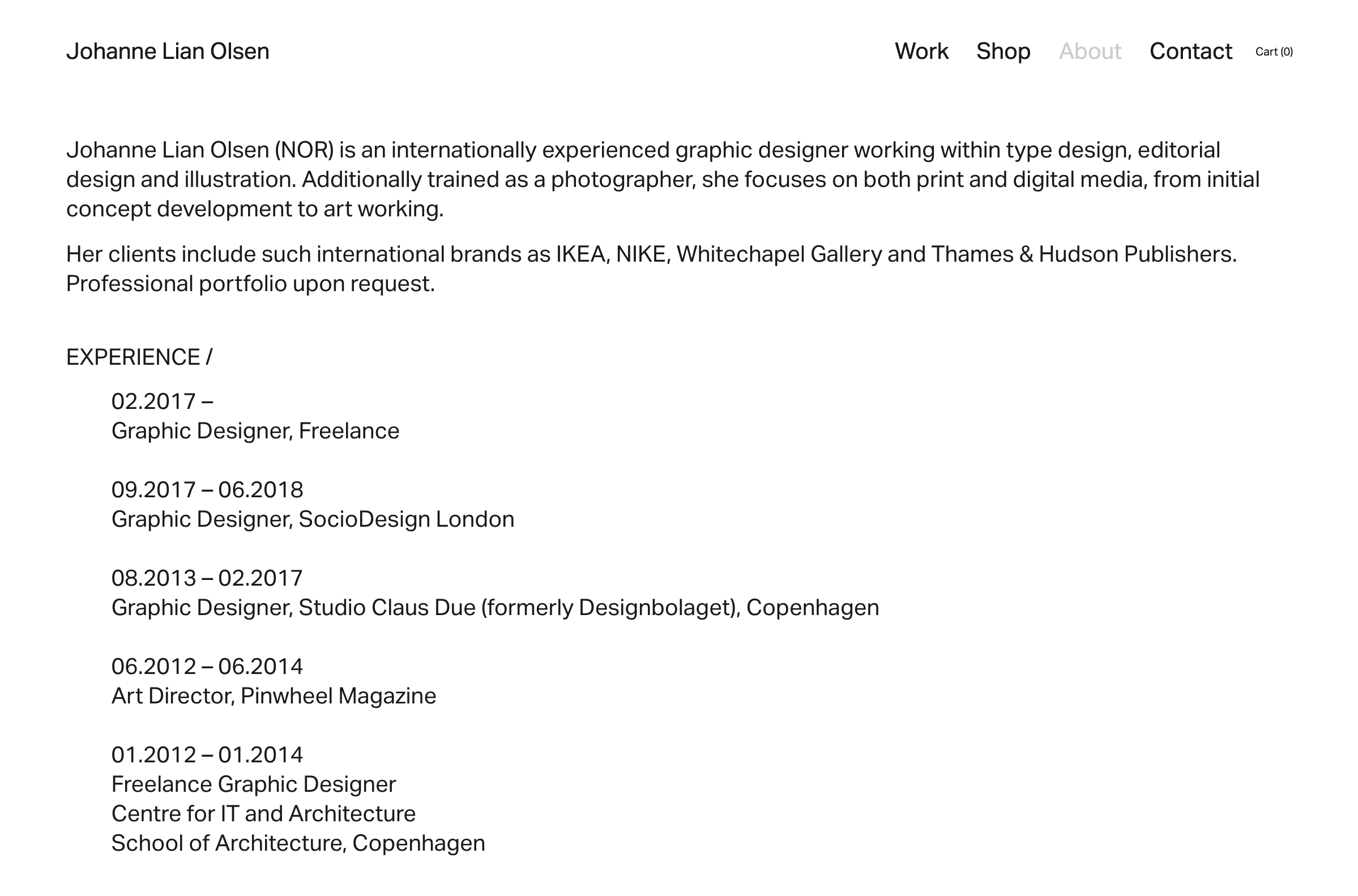
Another unconventional approach to designing yourAbout page is ditching the visuals and focusing on the most important information you want to communicate. Graphic Designer Johanne Lian Olsen went with this approach and designed a minimal, accessible web page that gets straight to the point. She used only one typeface and created visual hierarchy through capitalizing headlines. Only a designer’s eye could have achieved this kind of effortless look and feel!

3. Showcase yourself in your element
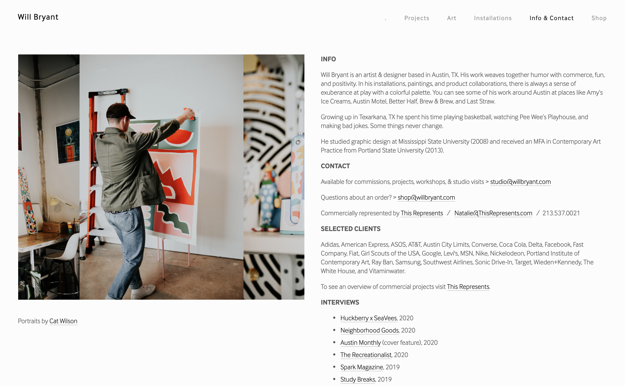
Artist and Designer Will Bryant got creative with his Squarespace template by adding a rotating GIF of images that not only showcases his headshot, but also his workspace and him creating inside of it. Instead of overwhelming your About page with tons of images (or trying to find just the right one to include), try Will’s approach and give potential clients a peek into your creative process, and what you look like in your element. There’s no better way to build trust than unveiling where the magic happens!

4. Create a central hub of information
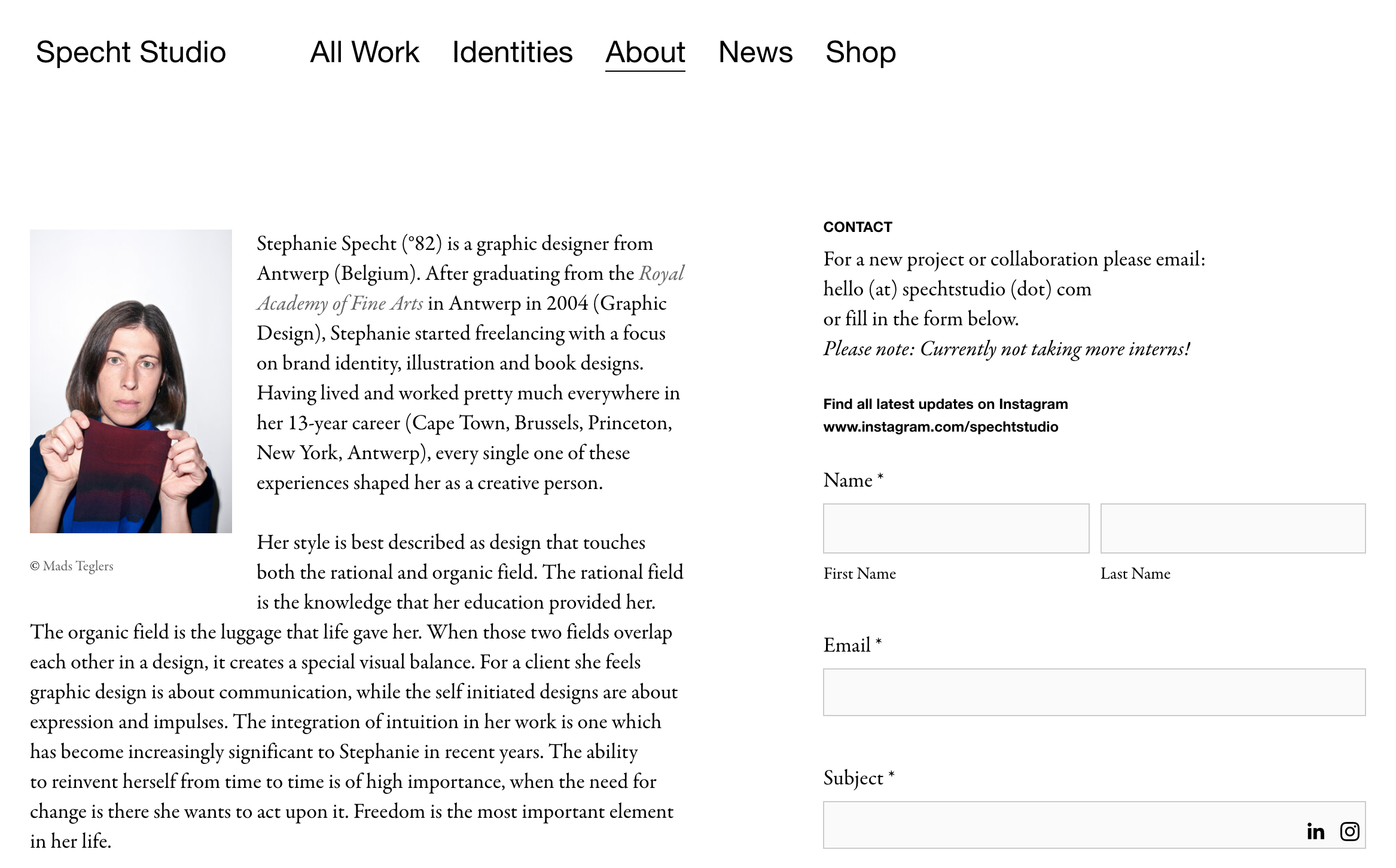
Stephanie Specht of Specht Studio has got just about every piece of information you’ll ever need to dig up on her About page. It includes her bio, past and current clients, awards, exhibitions, collaborations, and even a contact field that makes it easy for clients to reach out and seal the deal. This kind of About page acts as a central hub of information where folks can easily paint the full picture of your creative career, plus build trust in hiring you for their next project.

Get creative with your ‘About Me’ page
Now that you’ve got some inspiration for personalizing a stellar About Me page, start your free trial on Squarespace today and explore the endless creative possibilities. When you’re ready to launch your own website, use our dedicated code “DRIBBBLE” for 10% off. We’re excited to see what kinds of unique customizations you create for your own design portfolio!
Written by Renee Fleck
Published on
Last updated


