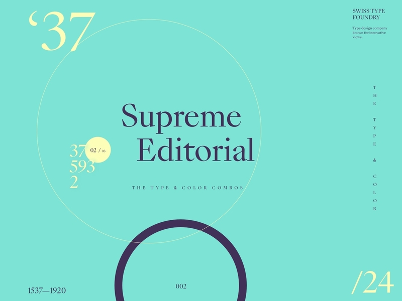
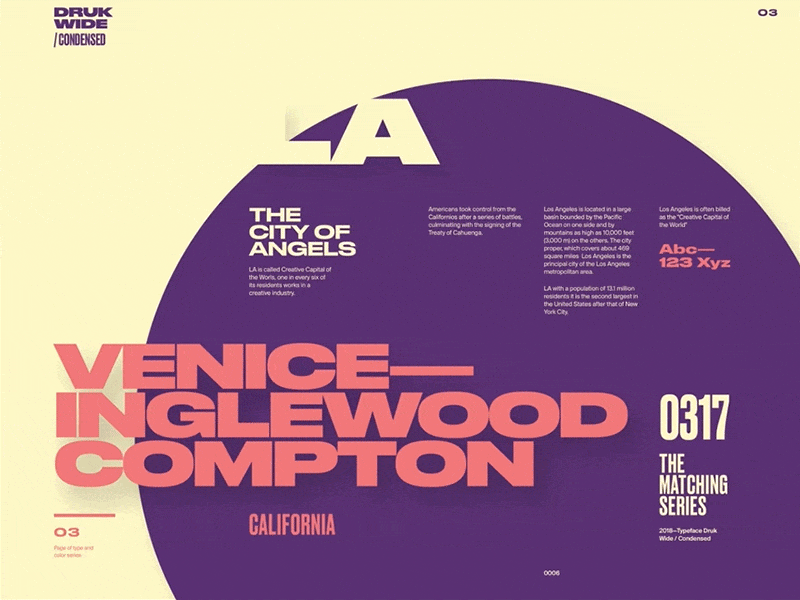
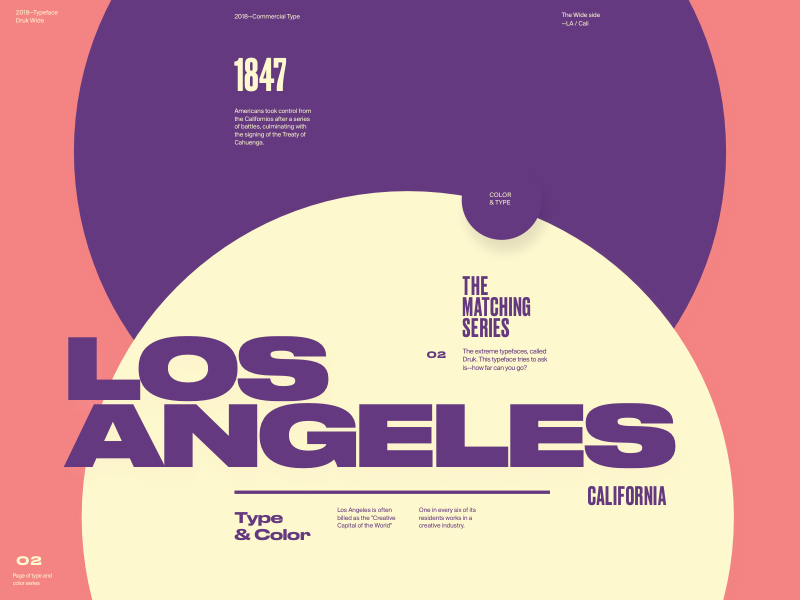
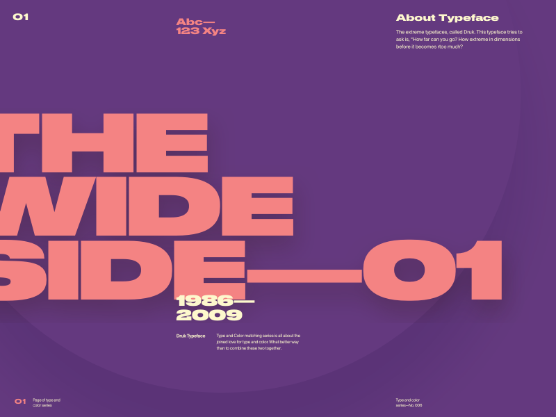
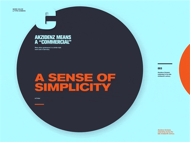
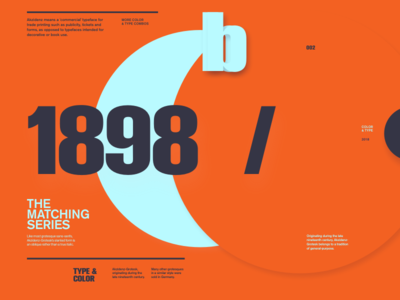
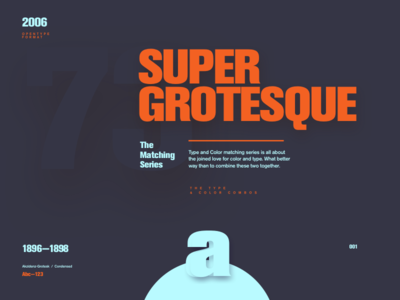
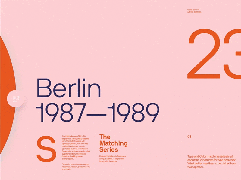
New round 007 of Type & color is ready.
This one is special, like Bond, Type Bond 😎
Versatile typeface (like 007 🔫), inspired with the graphic and editorial design combined in an elaborate supercollection.
Can you spot which typef...
Hello everyone,
here is the finished version in motion of a 6th round of Type & Color series.
Featured typeface is Druk, bold and charming typeface. Family has a lot of weights with beautiful contrasts in width. The typeface shows...
Hi all,
here is part 2 of 6th round of Type and color.
Featured typeface is Druk, intentionally designed without a normal width, nor lighter than medium weights. Designed by Berton Hasebe and published through Commercial Type.
It i a...
Hi all,
here is another round of Type and color—already 6th one 🤘
The typeface shows extremes, featuring the narrowest, widest, and heaviest styles :)
It's definitely not universally loved and it takes time to accept its character. B...
Hi all,
here is the finished version in motion of a 5th round of Type & Color series.
A featured typeface for this round is Akzidenz-Grotesk, originated in the late nineteenth century. Although Helvetica is similar to Akzidenz-Gro...
Hi all,
is Akzidenz-Grotesk, originated in the late nineteenth century. Although Helvetica is similar to Akzidenz-Grotesk there are some mayor differences like number "7", letter "R" and the size of the x-height.
Type & color is a...
Hi all,
round 5 of the Type & Color is here 🎉
Typeface is Akzidenz-Grotesk, originated in the late nineteenth century. Even the typeface is old fuck, it still has this nice grotesk, modern feel.
Although Helvetica is similar to ...
Hi all,
here is the finished version in motion of a 4th round of Type & Color series.
A featured typeface for this round NB International™ that comes in 7 styles. It pays tribute to popular Grotesk typefaces of the "inte...