Type & Color — 006 / 2
Hi all, here is part 2 of 6th round of Type and color.
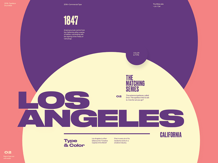
Featured typeface is Druk, intentionally designed without a normal width, nor lighter than medium weights. Designed by Berton Hasebe and published through Commercial Type.
It i a perfect study of extremes, featuring the narrowest, widest, and heaviest styles. It's bold and loud character makes it great for statement work.
Don't miss out behind the scenes & work in progress updates on Type&Color Instagram 👈