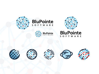
Some marks and logo concepts I put together. This was a fun project that involved doing a little research into space, globes, planets, stars, tech and cloud-based inspirations, and somehow I wound up looking at random animated memes. Go ...
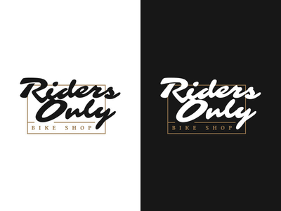
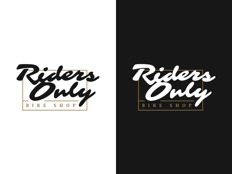
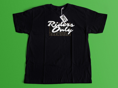
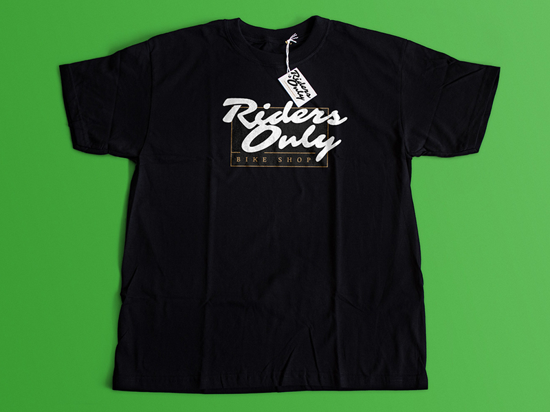
This is one of several logo and shirt design submissions for a client I recently put together. Im fairly enamored with this combination of vintage, elegant, and loose look and feel. Hopefully they enjoy it as much I do.
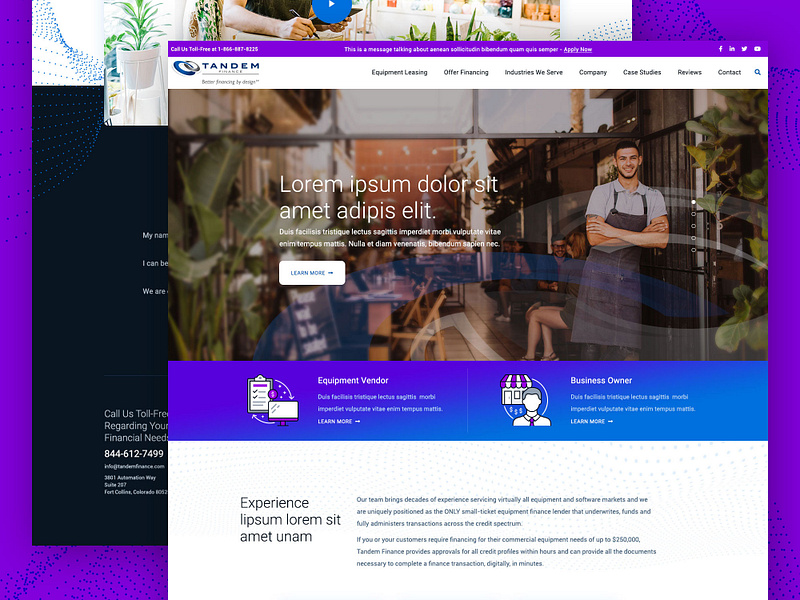
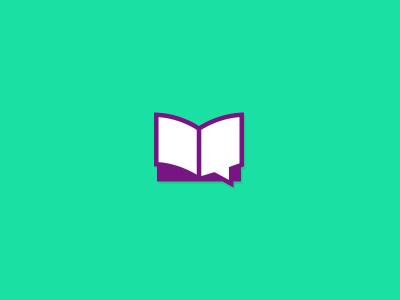
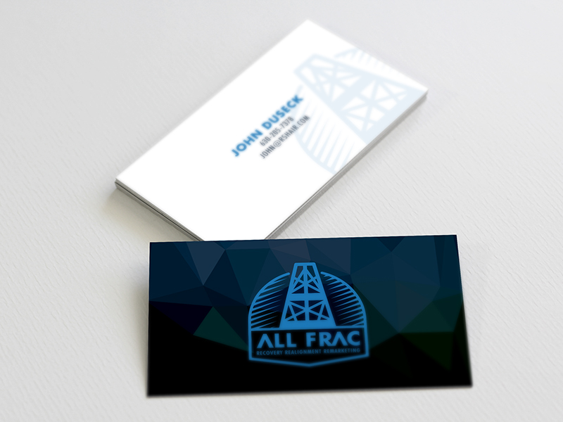
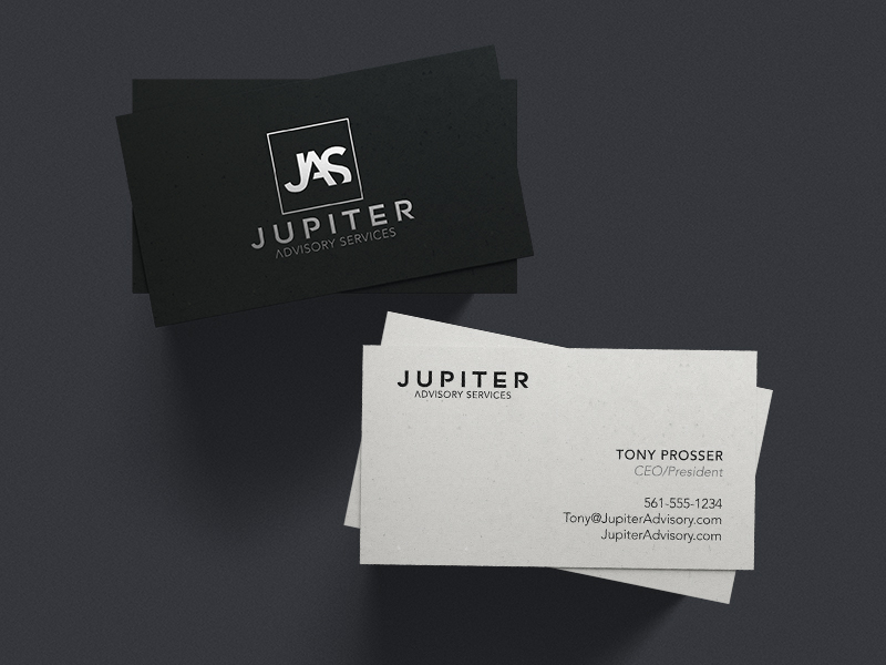
This is one of those projects that took forever to complete due to a lack of client participation. It has finally moved to "finished" list. I would have liked to see the tagline not included, however, I still like the design itself as wh...
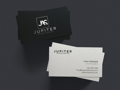
Wrapped up a clients logo last week. Strong, yet elegant. Bold, but soft. Both the typeface and mark can be isolated or combined for specific uses. Very happy to see this checked off the to-do list.
A couple weeks ago I did a super quick logo for a client that didnt really know what they wanted and it was something may or may not end up getting used. It was a big question mark all over the place. So, I did something super quick to j...