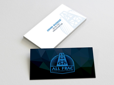
Logo and Cards
This is one of those projects that took forever to complete due to a lack of client participation. It has finally moved to "finished" list. I would have liked to see the tagline not included, however, I still like the design itself as whole.
The direction for this brand was to approach it more from clean, almost retro feel, but keeping it modern at the same time. Some of the rejected options were more minimalist and had a more vintage look to them. Anywho, Im a fan of business card designs, even thought I personally never use them.
More by Aaron View profile
Like


