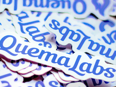
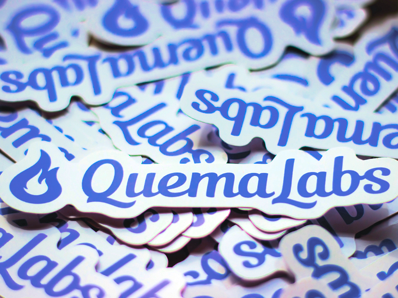
Insanely grateful QuemaLabs team for stickers.
Nice to see the results of their work : )
The full version of stickers you can see in the attached file.
The logo can be seen on their website : https://www.quemalabs.com
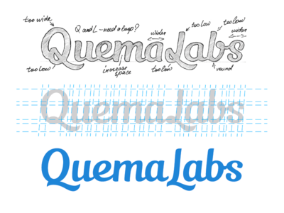
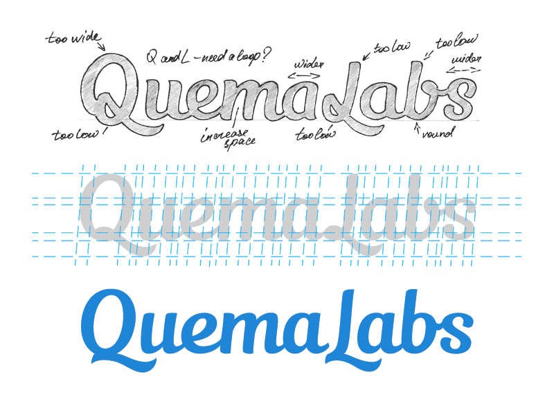
The second phase of work on the logo for Quemalabs.
It was decided to using a more classic font with a minimum of italics.
Particular attention was paid to work on a capital letters Q and L.
The work was conducted with three variants Q...
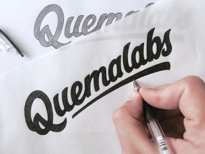
Work on the logo for the designer who creates beautiful WordPress themes.
One of the options.
Quema in Spanish means Burning, and therefore I decided to use a font with pointed edges.
I do not know how well it's turned out to implemen...