QuemaLabs
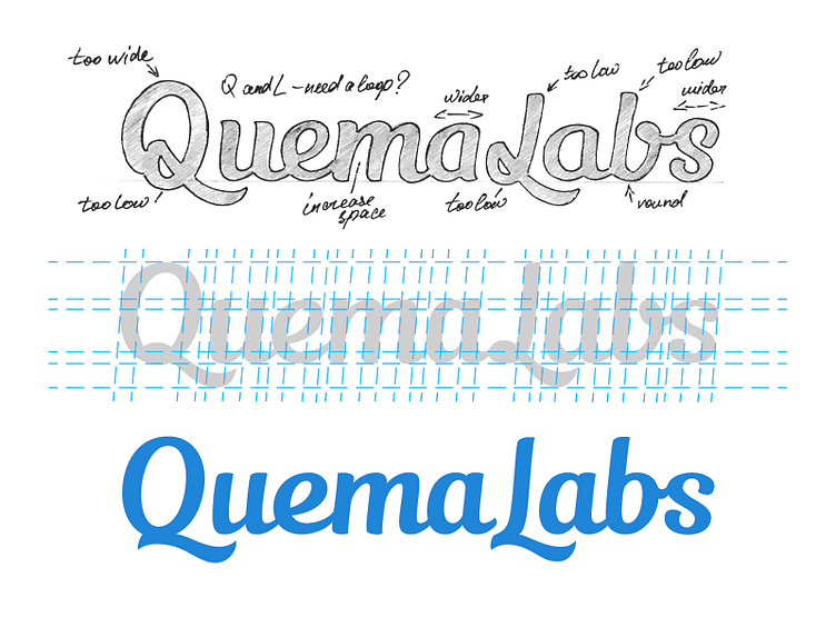
The second phase of work on the logo for Quemalabs. It was decided to using a more classic font with a minimum of italics.
Particular attention was paid to work on a capital letters Q and L. The work was conducted with three variants Q and L. As a result, it was decided to abandon the use of loops in these letters. Which option do you think is the most appropriate?
The logo will be used in conjunction with a sign. The process of the work on which I will prepare later.