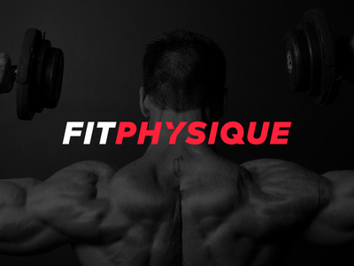
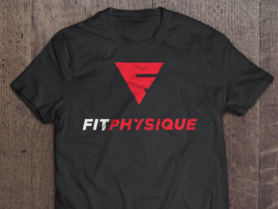
Fitphysique Wordmark

March 13, 2014

@Esben Lorenzen wanted to make sure the logo was unique even without the mark. The text was slanted to give it a fitness and strength feel. The triangle cut out of ‘Y’ was added to give the wordmark a unique look. We went with using two ...

Fitphysique Logo

March 13, 2014

Final logo for @Esben Lorenzen's Fitphysique. Quite a massive change from the previous version. We went with a stronger color. The text was capitalized to keep things simple and balanced. Check out the attachment for the horizontal ver...

Fitphysique Shirt

March 13, 2014

Application of the logo I made for @Esben Lorenzen. It would also look great without the name. Heck, I would totally wear it. See the attachment for a very hipster application of the logo. Tell @Esben Lorenzen to get these printed! Wou...

Available for new projects

Get in touch Jord Riekwel