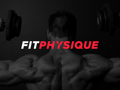
Fitphysique Wordmark
@Esben Lorenzen wanted to make sure the logo was unique even without the mark. The text was slanted to give it a fitness and strength feel. The triangle cut out of ‘Y’ was added to give the wordmark a unique look. We went with using two different colors on the wordmark to make it easier to read, and just because adding a third color looks really nice.
See the attachment for the logo on a different color.
Let me know what you think people!
More by Jord Riekwel View profile
Like


