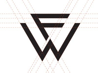
WIP - Brandmark v3


Next stage of development. The two more or less final marks.
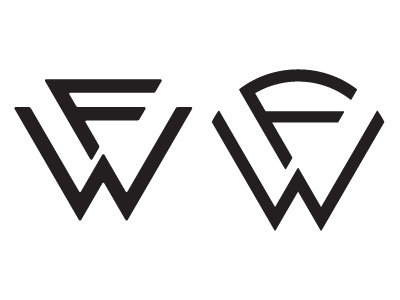
a. The client said that the first mark (on the left) was a bit too harsh, so I softened up the edges a bit. Does it look 'softer'? See 'harshornot.jpg'
b. The client still likes the rounded mark so I touched it up a bit as well, balancing it out and bringing it closer to the first mark. See 'oldvsnew.jpg'
Any thoughts or advice is welcomed. I am wearing my thick skin today. ;)