Neu Metal
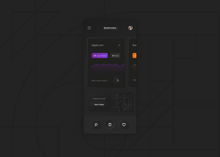
my own personal take on neu design. I like the idea of depth but the current trend(my last shot) is just way too much. It should be more flat than 3d. I feel like adding card shadows along with bevel edges is too in your face as well. thoughts?
More by Parker Hutchinson View profile
Like
