Business Card Design Concept - The JRT Agency

Back when I was a web designer at The JRT Agency we were in the process of a subtle brand shift. The company name for 42 years was the J.R. Thompson Company and was re-named to The JRT Agency in 2016. This required a few changes. One of the primary brand identifiers is the business card that every employee uses to represent themselves and the company.
I was not part of the committee who spearheaded the logo re-design or name change. But when I heard they were looking to create new business cards for all of the employees with the new branding, I instantly had an idea of what I thought they should be, so I hopped on Photoshop to create this mockup of my vision for a new business card design.
It was very well received by those who saw this design but it was ultimately never used or produced.
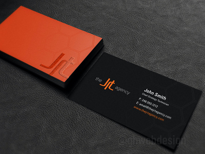
The card design is meant to be fairly minimalistic and only use the two colors - but be very colorful overall, so it would stand out in the pile. The card itself would be extra thick with black as the edge/depth color. The card is silk coated with dark gray (black) on the employee ID side and the brand/front side is the company primary orange.
The "JRT" logo on the front would be either a non-raised or raised Spot UV. There's also a subtle hexagon pattern in the background on both sides that would be a non-raised Spot UV, but not very prominent. Those Spot UV elements would be reflective to give the card a slight shimmer when holding/moving in the light.
I was very happy with this design and hope to come up with more in the future.