Calculator app
I know that a task "calculator" may mean something like "credit calculator", but I decided to focus simply on an app for mathematical calculations.
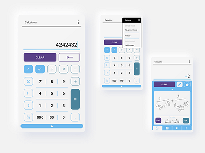
Numbers and the most popular actions (+, - , *, /, =) are positioned in the middle and on the right side of the screen.
"=" is intentionally positioned a bit higher, not to the very bottom right corner. Because it's really uncomfortable to stretch your thumb in the lower right part of the screen.
Not only right-handed folks should enjoy ease of use by one hand, so options intend to let you mirror the buttons.
Colours.
Initially it was red-blue-green. You know, green — for enter and main actions, red — for deleting things, and blue — for secondary actions. (It looked this way: https://drive.google.com/open?id=1ViGZx_i3PX4a_kXmOUxrE13wj3RNT7VB)
But then I decided to keep the idea of colour coding, but make the colours more close to each other. Like, to keep their functional differences, but make them differ in more subtle way.
Both red and green are kinda present on the same places, but they are more subdued.
