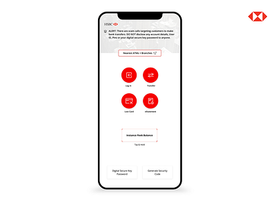
HSBC Cover Redesign
Hello! 👋
Been working on the HSBC mobile app and this is another design for my cover page (before logging in). Please see my previous post for my previous design and you'll be able to see the difference.
I have been going about changing the UI to find a suitable look and feel:
1. Adjusted the four "quick access" functions into bigger buttons that would fit a regular thumb-size when pressing/tapping
2. "Instance Peek Balance" button remains the same because I did not want to make it red/ too red as it may seem like an error instead. In addition, according to my small surveys: the top reason users log into the app is checking their balance, hence, the position of the button is where the thumb would naturally be able to reach as an individual holds his/her phone, for more effective and natural experience
3. Shorten the image on the top banner and outlined the button for "Nearest ATMs + Branches". Wanted to only impart the color red on the four main functions as the focal point and not be distracted by a top red button instead
More visuals & reading 👁📖: https://www.behance.net/gallery/92114363/HSBC-Redesign-Project?
I would appreciate any constructive feedback and come show some! ❤️
