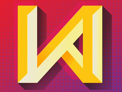
Poster Typography: WRONG
Section of a piece I'm doing for a typographic poster exhibition, which is a celebration of the potential beauty found in deliberate wrongness. The overall poster reads "WRONG." This is my favorite character.
More by Brian Gartside View profile
Like
