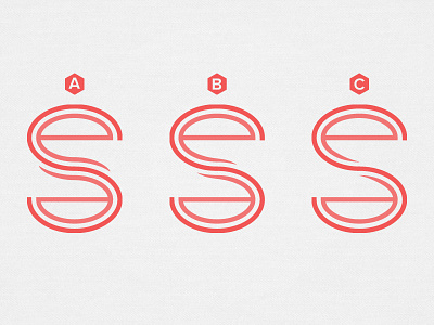
EES Monogram - Round 2
Refined the monogram after some feedback. Shorter in size, separated the letters farther from each other to make each letter more noticeable, and shortened the tail of the "e"s to make it read less like "esse". Which one do you believe works the best? What would you also recommend?
More by Erin E. Sullivan View profile
Like

