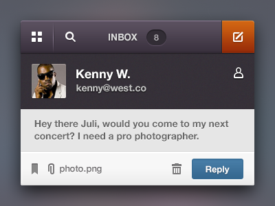
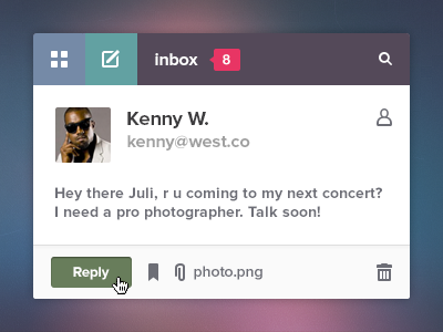
Email widget
I was curious how would this widget look like in more "traditional" style. The main styles (flat ui) are set in stone for this project but still I gave it a try during the coffee evening time. Otherwise I wouldn't sleep very well.
I took every bit of feedback I receieved from you awesome dribbblers and what I got on email/PM so ♥ thanks to all of you!
Played with colors a lil bit but left the main purple and ocean blue. I also applied this technique with orange button I developed for 23snaps iPhone app and I kinda like how it emphasizes the important action.
✔ Alternative Compose button here
✔ All dark version here
✔ Retina version here
Do you think this concept has a chance to live anyway?
Consider it just a practice of inquisitive mind.
Update: I know some people don't like rebounds of their work, and it would be cool to have an indication of whether the shot can be rebounded, but as we don't have it yet, I'm writing here:
Please feel free to rebound my shot, Rebound Alert!
***
Thanks again you all rock,
@Julia


