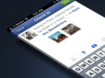
Facebook Checkin Screen
Little improvement of the checkin screen on Places, clean and simple, I'm just not a big fan of their blue bar with icons to the left and other to the right, that's a bit too much. More here.
More by Robin Clediere View profile
Like

