Human Icon
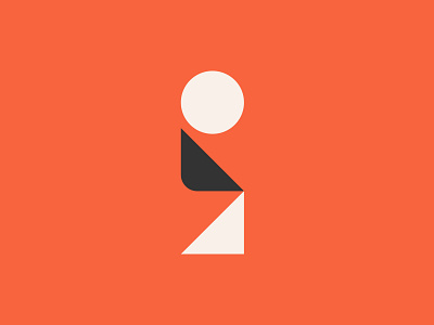


A little logo exploration that didn't survive. The Letter "I" meant to look like a seated person to reference the client's customer service reputation.
A little logo exploration that didn't survive. The Letter "I" meant to look like a seated person to reference the client's customer service reputation.