Messenger Fellowship Logo
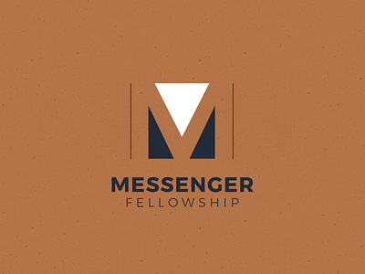

I was asked by the organization to take over a logo redesign project that wasn't going well. The leaders were frustrated and they were at the point of just picking something to be done with it. My goal was to finish the project on a high note, giving the organization a logo they would be proud of.
There's a few hidden meanings in the logo that point to some of the organizations values and mission, but the primary one is the bold upside-down triangle. This represents "The Radical Middle," one of the organizations core values. Case study coming soon!