(almost) Monochromatic Share Buttons

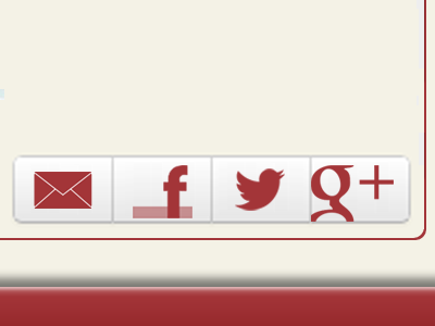
The major challenge was to offset the facebook "f" without it looking...well, just off in these rectangle bootstrap buttons. The 40% opacity bar gave the illusion of the facebook square and visually oriented the familiar offset- as minimalist of a solution as possible (without convincing the engineer to make the buttons square)