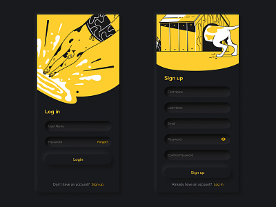
Neomorphic Login System Dark UI Design
In the early years of the modern user interfaces, we used to have skeuomorphic designs; it was a design mimicking its use case. For example, buttons were glossy, and the trashcan icon resembled deleting, and so on.
After the reign of the skeuomorphic was over, we had minimalistic design; the depth effect from skeuomorphic design disappeared, and we replaced it with a minimal, flat design.
The neomorphic effect is a combination of the current famous flat UI and the old skeuomorphic principles! - Source: https://medium.com/@s.jagoori/design-trends-neumorphism-59a9ba9d9284
More by VitalDesignLab⭐️ View profile
Like
