FAGGOT RIOT; TYPOGRAPHY PLAY 002

“FAGGOT RIOT” is a series of visual case study designs using a single phrase as aesthetic motivation while simultaneously keeping the text as isolated content.
When creating this series of work, I wanted to keep the design minimal and still tap into boldness associated with these individual terms.
Like with most of my work, I started off on a blank 1920x1080 photoshop document. Smack dab in the middle of the page I typed out the phrase “faggot riot” in my go-to font Francois One. I knew from the start I wanted the design to be more about its overall visual look and less about what the actual phrase said, so I needed a new font.
After being inspired by the 1974 cover of Robert Charroux’s novel “The Gods Unknown”, I decided to go with the font BlackCastleMF.
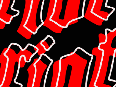
I was immediately drawn to this cover because of its vivid red background and title that seemed to hover above the page with an aesthetic glow that asked you to stare at it. And so I did, for hours. I snapped a quick photo of the book on my iPhone and uploaded it to photoshop so I could play with the text. I started by selected and separated the title, and all of the black words at the bottom. I wasn’t sure where I was going with this, but I saw an opportunity to rearrange the letters and start morphing this cover into something new.
Now back to the font choice, you might look at the cover of this book and not see much of a connection beyond the color scheme. The font on the book is some kind of old western-style and the Black Castle font is obviously more gothic. But let me draw your attention to the word “chariot” toward the bottom of the page. When I was playing with the selections of these letters, I couldn’t help but continuously see the word “riot” standing out amongst all the rest. My eyes kept darting back and forth between those letters and the title, those letters, and the title. This is what I wanted to emulate.
The way the words seem to be glowing on the page, how snugly the letters fit together, almost becoming their own image isolated from their reading. The way the word “riot” popped from the page. So I adopted the color scheme and created the first base design: just the words on the page.
I didn’t want it to stop there. When I stepped back from my monitor and looked at the phrase just sitting there alone on the page, it didn’t feel complete. I was still missing something, some kind of element or layout configuration that would take this design beyond just a random phrase on a black screen, it was still too much about the ability to read the phrase. So I merged all the layers and started zooming in and moving it around.
That’s what I was looking for! I started treating the canvas like the edges of a poster, not everything needs to in full proportions. I started cutting letters off, letting them run off the page, down the page, turning the layer on and off to start to pull attention around the page. After making quite a few horizontal designs, I started a new canvas and started playing with vertical ones. Those ended up being some of my favorites.