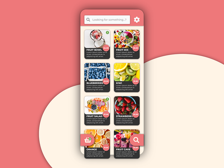
Smart Cafe App Product Screen
So for this design I chose to display the products as fruits since I didn't want to risk any copyright issues if I would to display a snickers-bar for example. Besides, fruits look good. 🤷♂️ Placed a floating search button at the bottom of the screen to easily access the search bar at the top. I like to keep the user from changing grip too much. An app should ideally be navigable with one hand imo. What do you guys think? Too much detail in this shot?
More by Georgios Apostolidis View profile
Like
