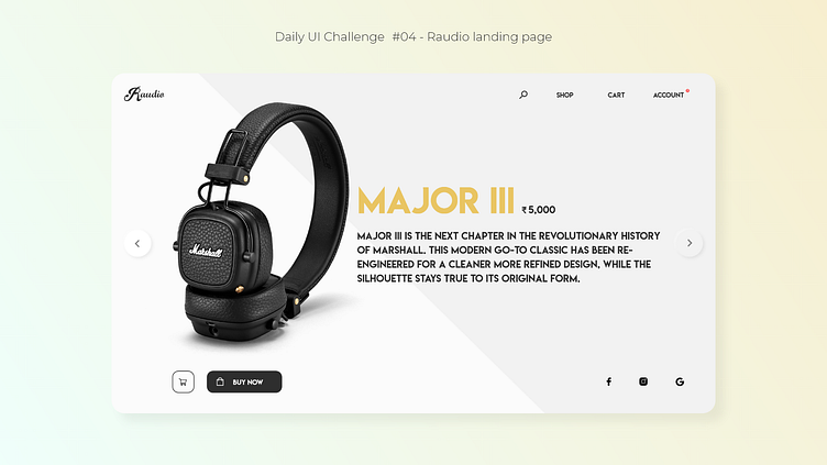
Daily UI Challenge - (04) Raudio landing page
Hey everyone !
This is a ‘Landing Page’ concept created by me using Adobe Xd. It was a part of the 10 day UI challenge taken up by me. I took up this challenge to enhance my UI skills and challenge myself daily by creating engaging, aesthetic and usable interfaces.
----------------------------------------------------------------
▪️ I conducted my secondary research about the landing pages created for top audio brands in the market which target the ‘audiophiles’. The aim here was to create an attractive and modern design concept for which my thought process is stated below.
▪️ I utilised the ‘Z-pattern’ used by the users while perceiving the UXUI design, due to which I gave more prominence to the product imagery on the left-hand side followed by the product name and its cost on the right-hand side. Just below it, I added the description and finally the ‘add to cart’ & ‘buy now’ CTAs at the bottom of the screen. Due to the CTA placement at the bottom, the users would easily discover them after they read out the information displayed on the screen.
I placed the social media icons on the bottom-right of the screen for the users to easily go and check them out, incase they require them.
▪️ There were navigation chevrons added on the LHS and RHS in the first-scroll of the homepage for the user to easily switch between the recommended/trending products offered by the company. The company logo (’Raudio’ - dummy name) showcased on the top-left would also double up as a homepage shortcut, thereby increasing overall usability. Other relevant redirection links are clearly labelled and statically placed on the top-right of the homepage for the user to easily manoeuvre the website.
----------------------------------------------------------------
Do check out my other work & let me know how y'all found this one ! 😄✌❤
