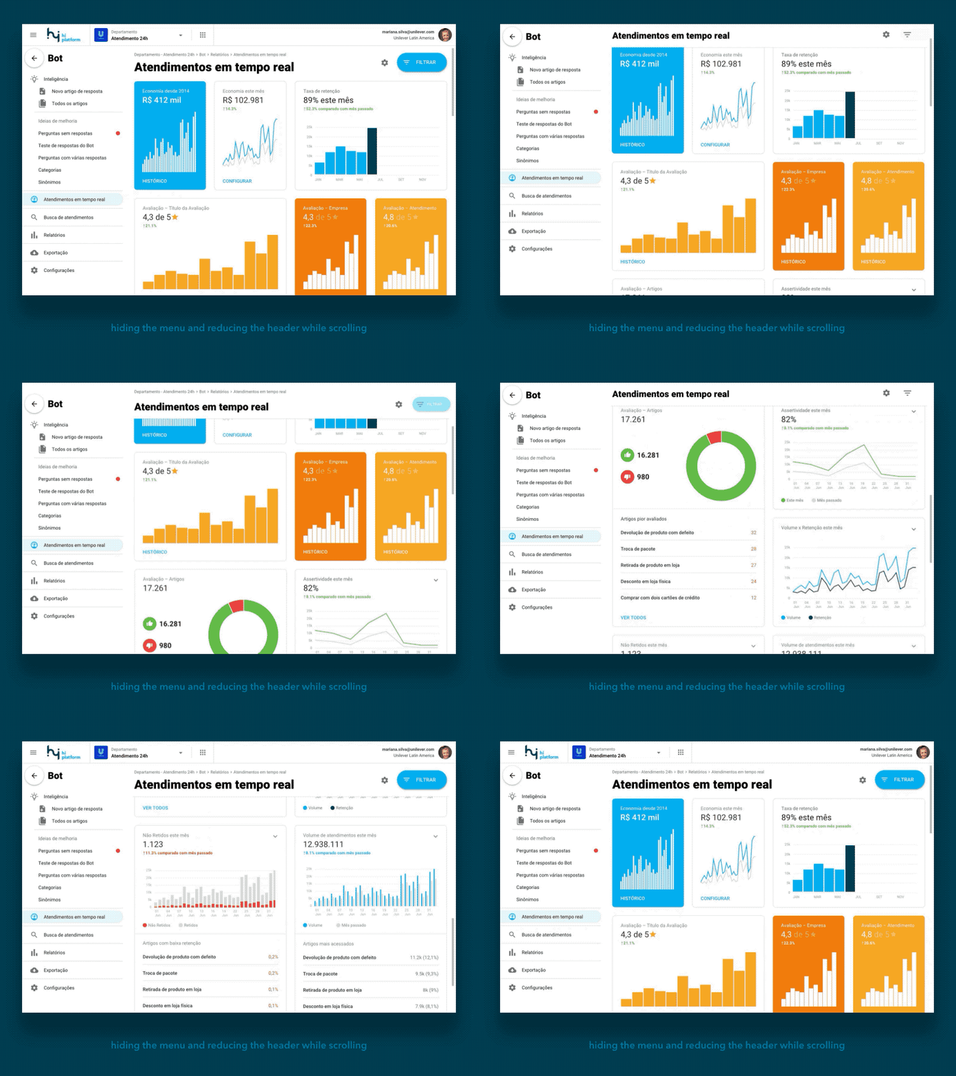
On scroll hiding menu
The idea behind this on scroll hiding header effect, is to enlarge the charts viewing area by taking more advantage of the viewport's vertical space.
We had a problem on our previous navigation structure in which, by observing our users, we've discovered that constantly they we're going back to system's home to go somewhere else on the navigation.
It turns out, that they were memorizing the routes because it was hard to find where they were and how to go back to an upper level of the navigation.
With this new prototype, we have been recording them again, and find out some interesting things:
- The breadcrumbs was necessary to inform where they area but not necessarily their first choice to go back;
- The back button in the sidebar menu is far more used than the breadcrumbs when they were asked to go to other pages;
- The persistent title was something desired since the users use to printscreen and share the reports with others. This helped to quickly inform what kind of data this third user was actually seeing.


