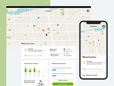
Dashboard homepage
Explored a Map centric design for Culdesac product dashboard vision sprint. As a web based product, it had to flex down to mobile since most resident would probably use the service on their phone at home. I like culdesac's technological vision. By focusing on a relevant, simple web product and not choosing the app route, they pave the way for a more reasonable experience, less intrusive while still technically capable.
More by Nicolas Solerieu View profile
Like
