Discovery - Logo Redesign
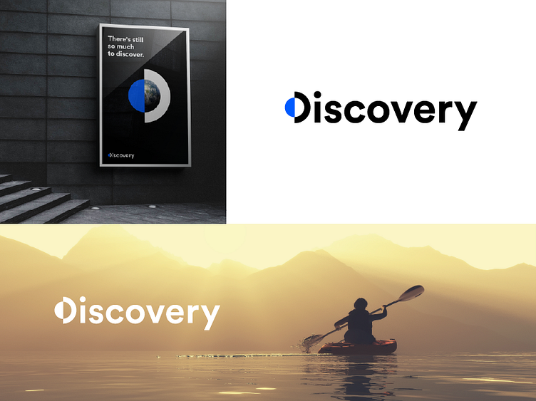
I wanted to try my hand at redesigning the Discovery logo. 💡 I got carried away with a concept: "There's still so much to discover" 🌎
The divided planet represents "the other side", the one still to be discovered and full of surprises.
I had fun, take it as a simple point of view: my point of view 🙂
Happy to hear your thoughts 💬
✅ Hire me: hello@emanueleabrate.com