Superbly Logo Guidelines Poster - Template for Download
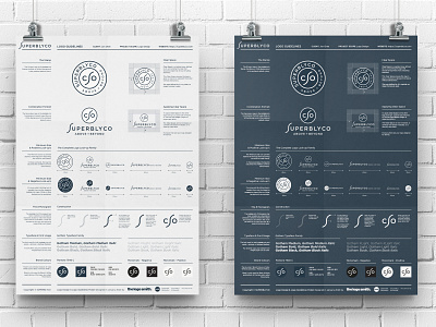
This is a Logo Guidelines Poster and Illustrator Template that I've created for a recent client of mine, SuperblyCo.
You can download a free copy of these Logo Guidelines further down in this post.
As this particular set of logo guidelines is pretty unique, in so much as the space given to the 12 logo lock-up's (6 positive and 6 negative), as well as the Construction section for the SuperblyCo S Monogram, you'll likely be wanting to change the layout of this to suite your own needs.
These are the 2 main logo layouts that SuperblyCo will be using, with a positive and negative version for both layouts, as seen in these Guidelines.
I think it will still be useful for you as a starting point for your own logo guidelines, given the vertical and horizontal flexibility with the 3 horizontal and the 8 vertical grid format.
For example, you may not need the Construction Section, but might need more room for your Primary/Secondary Lock-ups for example, or you might just want to make some of the sections bigger, such as giving more room for the Clear Space section; you could drop the Clear Space below the Primary lockup section, and just remove what you don't need.
So although these logo guidelines were created as a bespoke layout for SuperblyCo, you should still be able to utilise and hack much of this template for your own needs.
Logo Clear Space
Notice that I've made a point of starting that the Clear Space is not derived from some special formulas or equation (above). So although yes, I've put in the obligatory 'X', this is just to high light the Clear Space area that I've recommended.
I've suggested 1.5x the height of the wording (ideally the tallest letter, which might be uppercase, or just a tall lowercase letter if your logo wording is all lowercase) for the Clear Space.
You can increase this Clear Space if you really feel the logo deserves it, especially if it's quite a detailed logo, then this might need more Clear Space just to stop other elements from causing a distraction.
White Space
Just use common sense; keep in mind that White Space is your friend, so generally err on being generous, rather than stingy, with the Clear Space.
Basic Grid
I created this Guidelines Poster to a basic grid (you can see the guides in Illustrator and below in Cyan), and created Illustrator layers for various sections and elements to keep things all neat and tidy.
The 1/3 left side columns is primarily for descriptions, with the following 2/3 column for the graphical elements, the top half of which is a full ⅔ wide, with the bottom half having been split into a further 2 smaller columns.
Logo Construction
I added a little section on how the SuperblyCo S Monogram was created.
On the surface, it looks like a simple wavy line, but there are a few details within this Monogram that bring the shape of this S more in line with the varied shapes of a regular font, or in this case, the Gotham Typeface Family.
In particular the vertical shaft is a little wider than near the top and bottom where it flattens out, also I reduced the curvature of the ends a little bit. Subtle, but that's what it's all about.
Download the Logo Guidelines Template
The download file is an Illustrator .ai file with 2 pages; one for the light (positive) page, and one page for the dark (negative) page.
You might not need the dark version, so you can just delete that and focus on the 1 page, or you might need 2 pages for your primary and secondary logo lockups, in which case you could give each one their own page. Entirely up to you how you end up using this template.
PLEASE remove all instances of the SuperblyCo logo, and also my own details in the footer.
