Telemedicine App
The team is available for new projects! Drop us a line: hello@purrweb.com | WhatsApp | Website
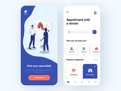
Telemedicine is still the hottest trend in the healthcare industry, isn’t it? With this thought in mind, we visualized an app that helps to find a nearby doctor with ease. Check out the details!
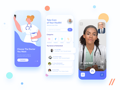
💊 When it comes to patient-doctor communication, text messages may not be the best option for everyone. To achieve a better UX and boost the level of real-life interaction, we integrated the ‘Video call’ feature into the app interface.
💉 To add more breathing space in the UI, we embedded a horizontally scrollable list. Users just swipe left/right and pick the most relevant specialist.
🔬 When deciding on colors, we thought smth like ‘Healthcare apps are mainly about being clean. Not about being boring!’. To evoke a sense of freshness and modernity, we picked light blue as the secondary color.
What do you think of this solution?
Press L if you like it and share your feedback in the comment!
Created by Julia Tikhiy-Tishchenko
We share experience in designing interfaces for healthcare startups 🏥, give insights into developing an app for pet owners 🐈, and reveal the secrets of coming up with a competitor to famous services 🤩
Keep in touch and check out our recent news 💜
Join us on:
Website | Instagram | Medium | Behance | Facebook


