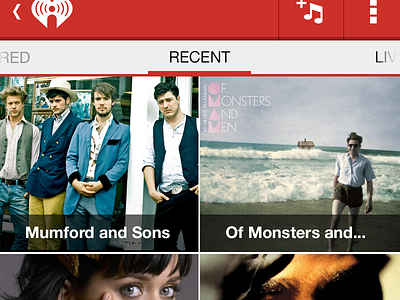
My Stations Screen

Made some changes. I realized my dimensions were off to present on a Galaxy Nexus. Which turn out better in my favor.
1. I added the static tabs at the top because I didn't think it would utilize more than 3. I moved recent to home and that will only show your last 2-4 recent stations. I think it's cleaner this way and also gives the user a slide or one click to what they want.
2. I made the grid a bit more on brand with iHeartRadio but still kept an Android feel. I thought the the other way was too Android and there should be a uniqueness to the app. I felt it lost that with the earlier shot.
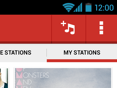
Then I also decided to go with the drawer (which I'll be posting in a minute) to have some other features iHeartRadio's current app doesn't give you access to. Let me know what you think.