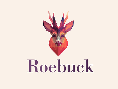
Roebuck
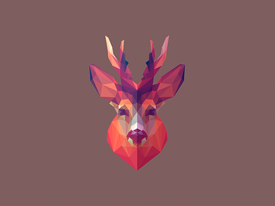
Final version of Roebuck logo design.
Roebuck is a survivalist/bushcraft app that aims to educate users with key survival knowledge, and reinforce this knowledge in an engaging and meaningful way.
The idea behind the logo concept is a low-poly roebuck, head-on in front view to show a good symmetry. In addition, I tried to convey the idea that one side of the roebuck's face was in shadow, to represent the light and dark sides to the reality of survival.
Let me know your thoughts on this one, fellas :)