Naomi's House Logo Refresh
One small piece of a large visual identity expansion being done for a local organization that provides exceptional care for victims of sex trafficking. This is an issue very near to my heart and it is an honor to serve the needs of NH with the talents I have been given.
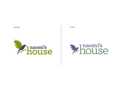
The previous iteration of the logo was moving in the right direction, but the colors needed to be calmer (less like Laffy Taffy), the typeface needed some refinement and the proportions needed better balance.
Typeface: Archer