"working styleguide"
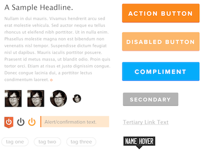
I often get to a stage in a new project where I've got sketches illustrating a large area of the product surface at a high level, and want to start to go 'higher fidelity' on specific areas -- usually meaning I want to start to address things like alignment, hierarchy, and layout working in actual pixels. I don't actually want to get too deep into visual design, but it's useful at this stage to have artifacts that "feel real" -- and so I'll sometimes come up with one of these "working styleguides" that allows the comps to look like a real product, without actually investing serious time at this stage in the VX/branding/identity wormhole.
Just having *some* coherent visual framework to operate in makes all the difference, even if it's not the "right" one -- and, invariably, working with something like this, for me, has been one of the best ways to figure out what works and doesn't work visually, anyhow.