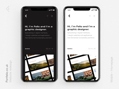
New portfolio site - Mobile Homepage
Like any designer knows, working on your own website and portfolio is one of the hardest things to do. We're quite often our most difficult clients! This redesign has been in the works for almost a year now, and I'm happy enough to share bits of what it'll now look like. I settled on the classic typeface Univers LT, using its wide variety of weights and styles to create a portfolio site that is minimalist in design, with a restrained look that will hopefully highlight the content across its pages. This is a view of the mobile version of the homepage, with dark and light variants.
More by Felio Sotomayor View profile
Like
