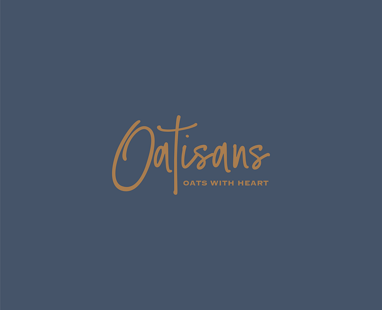
Oatisans Brand Identity
The client is small handmade high quality low quantity sweets maker. They focus around using oats for all products. In Japan oats are still not a very well received product and have a low image perception with average japanese. The goal was to create a brand identity that would resonate with japanese people enough to sense the handmade quality, care authenticity and still read as a good tasting product. The client felt that an identity that was stripped of too much formal branding with formal typography would take away the honesty and personal connection so we decided to go with this direction. Additionally, in Japan because people already have a strong appreciation for design and english alphabet characters it was important to make sure that the mark was still visually pleasing yet not too over the top. The O is very long and large to take away its weight the T is elongated at the base and isans has been drawn with a reasonable amount of tracking. While the track is not perfect and visually it could be seen as not exactly perfect, that is what makes it wholesome and honest. Too perfect is not handmade. That quality was important to convey.
