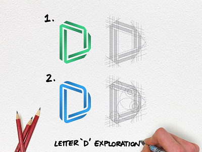
Letter D Exploration
Which is your favourite?
-
Part of my series designing a logo for every letter of the alphabet, we arrived at D. Not the easiest letter, the simplicity of it makes it hard to innovate, but I think I came up with something that looks pretty rad. Not sure which I prefer though, the geometric or organic. First one is more dynamic but the second flows better, help me decide!
-
This effect has definitely been used before, but hopefully not in this context 🤟 hope you enjoy.
More by Robert Nowland View profile
Like
