Reach your goals
This is another shot from this project. I faced quite a few UX challenges here.
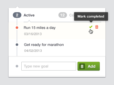
First of all I wanted adding / removing goals to be as easy and straightforward as possible. Fitness people are usually busy and they don't want to deal with tricky forms and buttons. So you can do pretty much it all in one click:
✔ Add new goal
✔ Delete existing
✔ Mark as completed (achived)
Btw, the little calendar in "Add" button launches a calendar popup to add the date to your goal, I didn't want any additional fields for that. If you don't choose the date it will be set to "in a week".
Also I wanted to tie together a number of existing goals and the dots which denotes the goal. So I couldn't actually use tabs in their natural design to divide "Active" and "Completed" and I used this tiny arrow and shadow to give it a feel of tabs / switches. The tabs bottom line would cut out the vertical line and I didn't want that.
The grey dot near "Type new goal" field tells that something you're typing isn't your goal yet but it might be if you add it. It's 50% opacity of the grey color of the active goal dot. Just a tiny addition.
☛ The red dot means - the goal due date is close, hurry up you!
More pixels here
Your feedback is always welcome.
P.S. As a note: I never remove my goal even if I can't achive it on time. It stays red as a reminder - hey girl next time get your stuff done on time!
***
Cheers,
☼ julia
