Garmin Connect redesign with Neumorphism 🏃🏻♂️🎨
Heyoo,
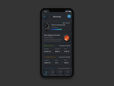
Decided to try experimenting with Neumorphism / Soft UI style on an app I use on a daily basis. I really love using my Garmin GPS watch for all my fitness activities :) and thought it be cool to try giving the app a new look (while keeping the badges since I really love their current artwork!)
The hardest part for me was the bottom navigation bar since Neumorphic cards pretend to extrude from the background such that when we look at it from the side we should see that it doesn’t “float”. This proved difficult for me because unlike in material design where the bottom navigation bars could just float above an object, with neumorphism the navigation bar would technically be on the same plane as the activity cards (if they were both protruding out they would collide into each other). I'm not quite sure what the best practice would be since I still don't have a good solution for the navigation bar. Another challenge was the soft ui buttons that have been pressed (active state) makes it quite hard to see from a usability standpoint, so I used some colors and shapes to help indicate that the button is active.
----Some helpful resources on Neuomorphism----
https://uxplanet.org/neumorphism-in-user-interface-tutorial-c353698ac5c0
https://uxdesign.cc/neumorphism-in-user-interfaces-b47cef3bf3a6
https://www.youtube.com/watch?v=G9yCM_rnC-w
----I used this Iphone Template by gregdlubacz----
https://gumroad.com/l/Apqo