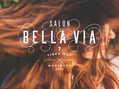
Bella Via Salon Branding unused concept 2
Another unchosen direction for a local salon. This approach had a lot of simplified marks as options with the system as well as some really intricate sub-marks but this main lock up with their address was my favorite mark. It would have looked pretty cool in their front window.
More by Alix Northrup View profile
Like
