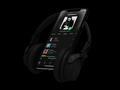
Spotify Navigation Redesign
After using Spotify for some time I spotted a few minor things that could be reworked. I did not get the music recommendations following my taste and some of it was just random. I would like to see more interactive and user-friendly Spotify.
I find current never-ending vertical scrolling in "Artist Page" unproductive. With the possibility of a new horizontal scroll menu all information could be at the tip of the finger and therefore faster accessible.
Thank you!
More by Marko Gveric View profile
Like

