Property Management Logo Re-Design
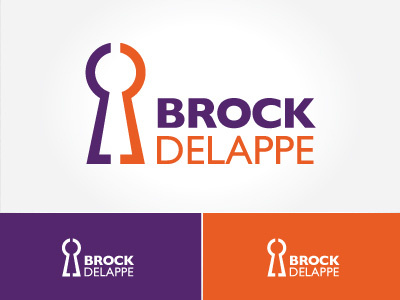
Being a successful Estate Agent offering clients sales, management and property letting services, I felt it was important to create a visual mark which was universal and would be relevant to all facets of their business. Choosing an abstract keyhole symbol helped to better convey the company offerings, while remaining easily recognisable, focused, creative and versatile - all goals the client wished to achieve. The icon itself also conveys the dual aspect to the company ownership and when viewed in reverse also doubles as the lowercase letters “B” and “D”, symbolising both initials in a very subtle way.
