Logo concept
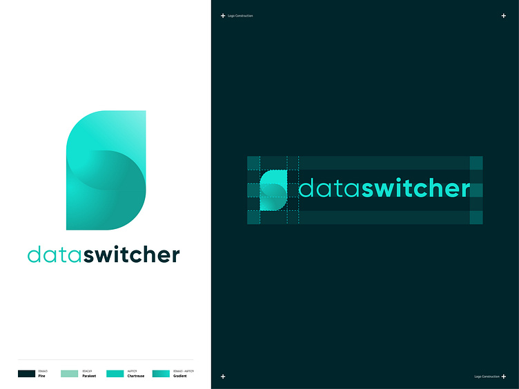
This logo concept was rejected by a client as they went for another concept. As one might notice, the brand mark consists a D and an S, which are integrated with each other. The gradients emphasizes the idea of 'switching'.
Happy to receive any feedback!
More by Nick Broekema View profile
Like
