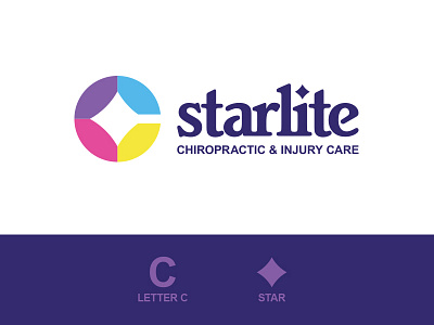
Starlite Chiropractic & Injury Care
I started out with the letter "C", which represents the words "chiropractic" and "care". This is what Starlite is all about, which is why it was important to highlight this aspect of the business in this design.
Inside this "C" letter you will see a 4 pointed star represents the "star" from "starlite". It also symbolizes a compass, which correlates well with the business's mission. Part of Starlite's mission is to point patients health back in the right direction after an injury.
The color sections in the "C" not only visually help magnify the compass star, but each color psychologically has its own meaning that represents the companies identity:
Purple - Wisdom
Blue - Trust
Yellow - Energy
Pink - Harmony
More by Reba Renee Design Studio View profile
Like
